


CSS3实现的文字弹出特效
发布时间:2021-04-15 17:18:54 作者:Nooray Yemon  我要评论
我要评论
我要评论这篇文章主要介绍了CSS3实现的文字弹出特效,帮助大家更好的理解和学习使用CSS3,感兴趣的朋友可以了解下
(福利推荐:你还在原价购买阿里云服务器?现在阿里云0.8折限时抢购活动来啦!4核8G企业云服务器仅2998元/3年,立即抢购>>>:9i0i.cn/aliyun)
实现效果

实现代码
html
<div>程序员之家</div>
<div>
  <span></span>
</div>


<p>a css3 animation demo</p>
css3
@import url('https://fonts.googleapis.com/css?family=Roboto:300');

body {
  text-align:center;
  background:linear-gradient(141deg, #ccc 25%, #eee 40%, #ddd 55%);
  color:#555;
  font-family:'Roboto';
  font-weight:300;
  font-size:32px;
  padding-top:40vh;
  height:100vh;
  overflow:hidden;
  -webkit-backface-visibility: hidden;
  -webkit-perspective: 1000;
  -webkit-transform: translate3d(0,0,0);
}

div {
  display:inline-block;
  overflow:hidden;
  white-space:nowrap;
}

div:first-of-type {    /* For increasing performance
                       ID/Class should've been used.
                       For a small demo
                       it's okaish for now */
  animation: showup 7s infinite;
}

div:last-of-type {
  width:0px;
  animation: reveal 7s infinite;
}

div:last-of-type span {
  margin-left:-355px;
  animation: slidein 7s infinite;
}

@keyframes showup {
    0% {opacity:0;}
    20% {opacity:1;}
    80% {opacity:1;}
    100% {opacity:0;}
}

@keyframes slidein {
    0% { margin-left:-800px; }
    20% { margin-left:-800px; }
    35% { margin-left:0px; }
    100% { margin-left:0px; }
}

@keyframes reveal {
    0% {opacity:0;width:0px;}
    20% {opacity:1;width:0px;}
    30% {width:355px;}
    80% {opacity:1;}
    100% {opacity:0;width:355px;}
}


p {
  font-size:12px;
  color:#999;
  margin-top:200px;
}
以上就是CSS3实现的文字弹出特效的详细内容,更多关于CSS3 文字弹出特效的资料请关注程序员之家其它相关文章!
相关文章
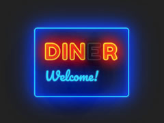 纯css3发光霓虹灯文字闪烁特效代码是一款彩色的店铺名称文字动画特效。2020-11-23
 是一段基于css3属性制作的鼠标悬停文字和图标动画切换效果代码,主要调用了蓝色和白色两种色彩元素,非常清新淡雅,欢迎对此段代码有兴趣的朋友前来下载使用2020-09-21
 css3鼠标悬停图片3D翻页显示文字描述特效是一款css3制作的鼠标悬停图片3D翻页显示文字介绍,非常好看的图文翻转展示特效。2020-09-10
 是一段基于css3+svg制作的线条边框文字轮廓动画特效,文字边框线条开始由一点向右边流动,将字体包裹完成后,在倒流回去,非常有意思,并且边框线条流动过程中,文字颜色也2020-08-25
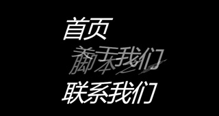 是一段splitting基于css3制作的鼠标悬停文字交叉切换,文字飘动切换效果代码,同时鼠标悬停后,文字还有翻转效果,欢迎有兴趣的朋友前来下载了解2020-08-20
 CSS3实现的立体文字重叠动画效果是一段基于css3 alpha属性设置文本透明度,重叠3D效果,波浪文字动画特效。非常个性有意思,欢迎感兴趣的朋友前来下载使用2020-08-07
 这是一款基于CSS3+SVG实现炫酷的霓虹灯发光文字动画特效源码。画面中央是一行空心文字,文字的边缘带有模糊发光的渐变色彩,且渐变色彩不断地变换着颜色,形成霓虹灯文字渐2020-02-13
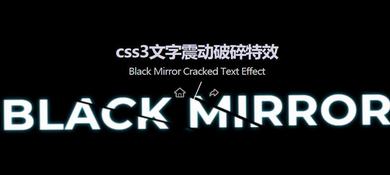 一个css3实现文字震动破碎特效,通过伪元素和CSS3帧动画来实现文字震动之后,碎裂开来的效果,简单炫酷2019-11-26
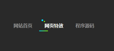 是一段基于css3 animation属性制作简单的滑动下划线文字导航,文字下划线效果代码,非常有意思,欢迎有兴趣的朋友前来下载使用2019-08-28


最新评论