


css3鼠标滑过实现动画线条边框
发布时间:2023-02-22 15:21:58 作者:水星记_  我要评论
我要评论
我要评论现如今网页越来越趋近于动画,相信大家平时浏览网页或多或少都能看到一些动画效果,今天我们做一个通过 css3 鼠标滑过实现动画线条边框,下面一起看看吧
(福利推荐:你还在原价购买阿里云服务器?现在阿里云0.8折限时抢购活动来啦!4核8G企业云服务器仅2998元/3年,立即抢购>>>:9i0i.cn/aliyun)
前言
现如今网页越来越趋近于动画,相信大家平时浏览网页或多或少都能看到一些动画效果,今天我们做一个通过 css3 鼠标滑过实现动画线条边框,下面一起看看吧。
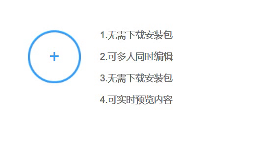
实现效果
完整源码
<template>
    <div class="parentBox">
        <div class="contantBox">
            <ul class="shelfBox">
                <li>
                    <div class="bigBox">
                        <div class="itemBox">
                            <div class="textBox">
                                <p>1.无需下载安装包</p>
                                <p>2.可多人同时编辑</p>
                                <p>3.无需下载安装包</p>
                                <p>4.可实时预览内容</p>
                            </div>
                            <div class="beginbox"></div>
                            <div class="bomBox"></div>
                            <div class="leftBox"></div>
                            <div class="topBox"></div>
                            <div class="rightBox"></div>
                            <div class="pictureBox"><i class="circleBox"></i></div>
                        </div>
                        <div class="iconBox">
                            <div class="circleBox">+</div>
                        </div>
                    </div>
                </li>
            </ul>
        </div>
    </div>
</template>
<style scoped>
    .parentBox {
        margin: 0;
        padding: 0;
        border: 0;
        font: inherit;
        font-size: 100%;
        vertical-align: baseline
    }

    ol,
    ul {
        list-style: none
    }

    table {
        border-collapse: collapse;
        border-spacing: 0
    }

    caption,
    td,
    th {
        text-align: left;
        font-weight: 400;
        vertical-align: middle
    }

    .bigBox img {
        border: none
    }


    .bigBox {
        text-decoration: none
    }

    .bigBox:hover {
        cursor: pointer;
    }

    img {
        max-width: 100%;
        vertical-align: middle
    }

    .shelfBox:after,
    .shelfBox:before {
        content: " ";
        display: table
    }

    .shelfBox:after {
        clear: both
    }

    .contantBox {
        position: relative;
        background-color: #fff;
        zoom: 1
    }


    .contantBox ul {
        position: absolute;
        left: 0;
        top: 0;
        width: 1218px;
        height: 432px;
        padding-top: 5px;
        transition: left .8s ease-in-out
    }

    .contantBox li {
        float: left;
        width: 406px;
        height: 216px
    }

    .contantBox li .bigBox {
        position: relative;
        display: block;
        width: 100%;
        height: 216px;
        padding: 10px 0 0 92px;
        zoom: 1
    }

    .contantBox .itemBox {
        position: relative;
        width: 274px;
        height: 186px;
        padding: 20px 0 0 60px;
        background: url('https://hovertree.com/texiao/css3/32/images/hovertree10tanjpxxxxblxpxxxxxxxxxx-274-186.png') 0 0 no-repeat;
        color: #00a0ff;
        zoom: 1
    }

    .textBox {
        color: #666;
    }
    .textBox p{
        margin: 14px 10px;
    }

    .contantBox .beginbox {
        position: absolute;
        bottom: -2px;
        right: -2px;
        width: 34px;
        height: 10px;
        background-color: #fff
    }

    .contantBox .bomBox {
        position: absolute;
        left: -2px;
        bottom: -2px;
        width: 295px;
        height: 15px;
        background-color: #fff
    }

    .contantBox .leftBox {
        position: absolute;
        left: -2px;
        top: -2px;
        width: 15px;
        height: 189px;
        background-color: #fff
    }

    .contantBox .topBox {
        position: absolute;
        right: -2px;
        top: -2px;
        width: 295px;
        height: 15px;
        background-color: #fff
    }

    .contantBox .rightBox {
        position: absolute;
        right: -2px;
        bottom: -2px;
        width: 15px;
        height: 189px;
        background-color: #fff
    }

    .contantBox .iconBox {
        position: absolute;
        left: 53px;
        top: 35px;
        width: 100px;
        height: 110px;
        padding-top: 12px;
        background-color: #fff;
        z-index: 11
    }

    .contantBox .iconBox .circleBox {
        width: 80px;
        height: 80px;
        line-height: 80px;
        background: url('https://hovertree.com/texiao/css3/32/images/hovertree1.fjxivxxxxbqxvxxxxxxxxxx-80-80.png') 0 0 no-repeat;
        text-align: center;
        color: #359EFB;
        font-size: 28px;
    }

    .contantBox .iconBox .iconfont {
        font-size: 32px;
        color: #00a0ff
    }

    .contantBox .pictureBox {
        position: absolute;
        right: -8px;
        bottom: -3px;
        width: 0;
        height: 16px;
        background-color: #fff;
        overflow: hidden
    }

    .contantBox .pictureBox .circleBox {
        float: right;
        width: 17px;
        height: 16px;
        background: url('https://hovertree.com/texiao/css3/32/images/hovertree15pjohvxxxxcaxpxxxxxxxxxx-16-16.png') 0 0 no-repeat
    }

    .contantBox .bigBox:hover .textBox {
        color: #00a0ff
    }

    .contantBox .bigBox:hover .bomBox {
        animation: borderslideBottom .15s linear 0s 1;
        animation-fill-mode: forwards
    }

    .contantBox .bigBox:hover .leftBox {
        animation: bordersildeLeft .2s linear .15s 1;
        animation-fill-mode: forwards
    }

    .contantBox .bigBox:hover .topBox {
        animation: bordersildeTop .15s linear .35s 1;
        animation-fill-mode: forwards
    }

    .contantBox .bigBox:hover .rightBox {
        animation: bordersildeRight .2s linear .5s 1;
        animation-fill-mode: forwards
    }

    .contantBox .bigBox:hover .pictureBox {
        animation: bordersildeEnd .1s linear .7s 1;
        animation-fill-mode: forwards
    }


    @-moz-keyframes borderslideBottom {
        from {
            width: 295px
        }

        to {
            width: 0
        }
    }

    @-webkit-keyframes borderslideBottom {
        from {
            width: 295px
        }

        to {
            width: 0
        }
    }

    @keyframes borderslideBottom {
        from {
            width: 295px
        }

        to {
            width: 0
        }
    }

    @-moz-keyframes bordersildeLeft {
        from {
            height: 189px
        }

        to {
            height: 0
        }
    }

    @-webkit-keyframes bordersildeLeft {
        from {
            height: 189px
        }

        to {
            height: 0
        }
    }

    @keyframes bordersildeLeft {
        from {
            height: 189px
        }

        to {
            height: 0
        }
    }

    @-moz-keyframes bordersildeTop {
        from {
            width: 295px
        }

        to {
            width: 0
        }
    }

    @-webkit-keyframes bordersildeTop {
        from {
            width: 295px
        }

        to {
            width: 0
        }
    }

    @keyframes bordersildeTop {
        from {
            width: 295px
        }

        to {
            width: 0
        }
    }

    @-moz-keyframes bordersildeRight {
        from {
            height: 189px
        }

        to {
            height: 0
        }
    }

    @-webkit-keyframes bordersildeRight {
        from {
            height: 189px
        }

        to {
            height: 0
        }
    }

    @keyframes bordersildeRight {
        from {
            height: 189px
        }

        to {
            height: 0
        }
    }

    @-moz-keyframes bordersildeEnd {
        from {
            width: 0
        }

        to {
            width: 34px
        }
    }

    @-webkit-keyframes bordersildeEnd {
        from {
            width: 0
        }

        to {
            width: 34px
        }
    }

    @keyframes bordersildeEnd {
        from {
            width: 0
        }

        to {
            width: 34px
        }
    }
</style>
到此这篇关于css3鼠标滑过实现动画线条边框的文章就介绍到这了,更多相关css3动画线条边框内容请搜索程序员之家以前的文章或继续浏览下面的相关文章,希望大家以后多多支持程序员之家!
相关文章
 这篇文章主要介绍了CSS3 按钮边框动画的实现,帮助大家更好的理解和使用CSS3,美化自身网页,感兴趣的朋友可以了解下2020-11-12
CSS3动画之流彩文字效果+图片模糊效果+边框伸展效果实现代码合集
这篇文章主要介绍了CSS3动画中流彩文字效果+图片模糊效果+边框伸展效果实现,blur滤镜实现和SVG滤镜实现以及SVG作为背景图片载入等操作步骤实现功能,具体操作步骤大家可查2017-08-18- 这篇文章主要介绍了一款效果非常炫酷的CSS3按钮边框动画特效,按钮的边框会以不同的方式进行各种动画,感兴趣的小伙伴们可以参考一下2016-03-16
- 这篇文章主要介绍了利用SVG和CSS3来实现一个炫酷的边框动画,不使用JavaScript使得编写过程轻松了不少,需要的朋友可以参考下2015-07-22


最新评论