


CSS3波浪效果示例(前端必学)
发布时间:2023-05-08 14:41:37 作者:国服第二切图仔  我要评论
我要评论
我要评论随着前端技术的不断发展与进步,界面交互的样式要求和美感也越来越高,很多网页的交互都加上了css3动画,这里作者给大家分享一个前端开发必掌握的一个CSS3波浪效果
(福利推荐:你还在原价购买阿里云服务器?现在阿里云0.8折限时抢购活动来啦!4核8G企业云服务器仅2998元/3年,立即抢购>>>:9i0i.cn/aliyun)
CSS3波浪效果展示:

这是使用 SVG 和 CSS 动画制作的波浪效果,上半部分是蓝色(可修改成其他颜色)渐变的背景颜色,下半部分就是波浪,有四条波浪在不停的来回起伏,非常逼真。该波浪效果可用于大部分页面的底部,使页面增加一点活泼的气息。
1.Html构建
代码如下(示例):
<div class="inner_header"> 填充蓝色(可修改成其他颜色)渐变的背景颜色
<div class="waves">这部分就是波浪的svg,有四条波浪在不停的来回起伏,效果非常逼真
		<div class="header">
			<div class="inner-header flex">
				<h1>简单的 CSS3 波浪效果</h1>
			</div>
			<div>
				<svg class="waves" xmlns="http://www.w3.org/2000/svg" xmlns:xlink="http://www.w3.org/1999/xlink"
					viewBox="0 24 150 28" preserveAspectRatio="none" shape-rendering="auto">
					<defs>
						<path id="gentle-wave"
							d="M-160 44c30 0 58-18 88-18s 58 18 88 18 58-18 88-18 58 18 88 18 v44h-352z" />
					</defs>
					<g class="parallax">
						<use xlink:href="#gentle-wave" x="48" y="0" fill="rgba(255,255,255,0.7" />
						<use xlink:href="#gentle-wave" x="48" y="3" fill="rgba(255,255,255,0.5)" />
						<use xlink:href="#gentle-wave" x="48" y="5" fill="rgba(255,255,255,0.3)" />
						<use xlink:href="#gentle-wave" x="48" y="7" fill="#fff" />
					</g>
				</svg>
			</div>
		</div>
2.CSS编写
代码如下(示例):
这里通过CSS3的animation动画属性来控制四条线条在不停的来回起伏,形成波浪效果
.header {
    position: relative;
    text-align: center;
    background: linear-gradient(60deg, rgba(84, 58, 183, 1) 0%, rgba(0, 172, 193, 1) 100%);
/* 	background: #FFAFBD;
	background: -webkit-linear-gradient(to right, #ffc3a0, #FFAFBD);
	background: linear-gradient(to right, #ffc3a0, #FFAFBD);
 */
    color: white;
}


.inner-header {
    height: 65vh;
    width: 100%;
    margin: 0;
    padding: 0;
}


.waves {
    position: relative;
    width: 100%;
    height: 15vh;
    margin-bottom: -7px; /*Fix for safari gap*/
    min-height: 100px;
    max-height: 150px;
}

.content {
    position: relative;
    height: 20vh;
    text-align: center;
    background-color: white;
}

.content a {
    margin: 0 5px;
    font-size: 12px;
    color: #333;
}

.content a:hover {
    color: #000;
}

/* Animation */

.parallax > use {
    animation: move-forever 25s cubic-bezier(0.55, 0.5, 0.45, 0.5) infinite;
}
.parallax > use:nth-child(1) {
    animation-delay: -2s;
    animation-duration: 7s;
}
.parallax > use:nth-child(2) {
    animation-delay: -3s;
    animation-duration: 10s;
}
.parallax > use:nth-child(3) {
    animation-delay: -4s;
    animation-duration: 13s;
}
.parallax > use:nth-child(4) {
    animation-delay: -5s;
    animation-duration: 20s;
}
@keyframes move-forever {
    0% {
        transform: translate3d(-90px, 0, 0);
    }
    100% {
        transform: translate3d(85px, 0, 0);
    }
}
/*Shrinking for mobile*/
@media (max-width: 768px) {
    .waves {
        height: 40px;
        min-height: 40px;
    }
    .content {
        height: 30vh;
    }
    h1 {
        font-size: 24px;
    }
}
3.完整代码
index.html文件
<!DOCTYPE html>
<html lang="zh-CN">
	<head>
		<meta charset="utf-8" />
		<title>简单的CSS3波浪效果演示_dowebok</title>
		<link rel="stylesheet" href="style.css" />
	</head>
	<body>
		<div class="header">
			<div class="inner-header flex">
				<h1>简单的 CSS3 波浪效果</h1>
			</div>

			<div>
				<svg class="waves" xmlns="http://www.w3.org/2000/svg" xmlns:xlink="http://www.w3.org/1999/xlink"
					viewBox="0 24 150 28" preserveAspectRatio="none" shape-rendering="auto">
					<defs>
						<path id="gentle-wave"
							d="M-160 44c30 0 58-18 88-18s 58 18 88 18 58-18 88-18 58 18 88 18 v44h-352z" />
					</defs>
					<g class="parallax">
						<use xlink:href="#gentle-wave" x="48" y="0" fill="rgba(255,255,255,0.7" />
						<use xlink:href="#gentle-wave" x="48" y="3" fill="rgba(255,255,255,0.5)" />
						<use xlink:href="#gentle-wave" x="48" y="5" fill="rgba(255,255,255,0.3)" />
						<use xlink:href="#gentle-wave" x="48" y="7" fill="#fff" />
					</g>
				</svg>
			</div>
		</div>


	</body>
</html>
style.css文件
body {
    margin: 0;
}

h1 {
    font-family: 'Lato', sans-serif;
    font-weight: 300;
    letter-spacing: 2px;
    font-size: 48px;
}
p {
    font-family: 'Lato', sans-serif;
    letter-spacing: 1px;
    font-size: 14px;
    color: #333333;
}

.header {
    position: relative;
    text-align: center;
    background: linear-gradient(60deg, rgba(84, 58, 183, 1) 0%, rgba(0, 172, 193, 1) 100%);
/* 	background: #FFAFBD;
	background: -webkit-linear-gradient(to right, #ffc3a0, #FFAFBD);
	background: linear-gradient(to right, #ffc3a0, #FFAFBD);
 */
    color: white;
}
.logo {
    width: 50px;
    fill: white;
    padding-right: 15px;
    display: inline-block;
    vertical-align: middle;
}

.inner-header {
    height: 65vh;
    width: 100%;
    margin: 0;
    padding: 0;
}

.flex {
    /*Flexbox for containers*/
    display: flex;
    justify-content: center;
    align-items: center;
    text-align: center;
}

.waves {
    position: relative;
    width: 100%;
    height: 15vh;
    margin-bottom: -7px; /*Fix for safari gap*/
    min-height: 100px;
    max-height: 150px;
}

.content {
    position: relative;
    height: 20vh;
    text-align: center;
    background-color: white;
}

.content a {
    margin: 0 5px;
    font-size: 12px;
    color: #333;
}

.content a:hover {
    color: #000;
}

/* Animation */

.parallax > use {
    animation: move-forever 25s cubic-bezier(0.55, 0.5, 0.45, 0.5) infinite;
}
.parallax > use:nth-child(1) {
    animation-delay: -2s;
    animation-duration: 7s;
}
.parallax > use:nth-child(2) {
    animation-delay: -3s;
    animation-duration: 10s;
}
.parallax > use:nth-child(3) {
    animation-delay: -4s;
    animation-duration: 13s;
}
.parallax > use:nth-child(4) {
    animation-delay: -5s;
    animation-duration: 20s;
}
@keyframes move-forever {
    0% {
        transform: translate3d(-90px, 0, 0);
    }
    100% {
        transform: translate3d(85px, 0, 0);
    }
}
/*Shrinking for mobile*/
@media (max-width: 768px) {
    .waves {
        height: 40px;
        min-height: 40px;
    }
    .content {
        height: 30vh;
    }
    h1 {
        font-size: 24px;
    }
}
到此这篇关于CSS3波浪效果示例(前端必学)的文章就介绍到这了,更多相关CSS3波浪效果内容请搜索程序员之家以前的文章或继续浏览下面的相关文章,希望大家以后多多支持程序员之家!
相关文章
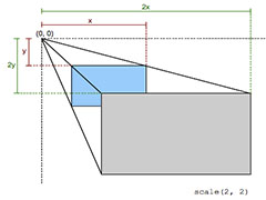 在CSS3中,transform属性应用于元素的2D或3D转换,可以利用transform功能实现文字或图像的旋转、缩放、倾斜、移动这4中类型的形变处理,本文给大家介绍css3中2D转换之有趣2022-02-18
 这篇文章主要介绍了css3带你实现3D转换效果,本篇的3D转换就是基于原来的2D转换而来,与2D转换的功能相似,本文通过实例代码给大家介绍的非常详细,需要的朋友可以参考下2022-02-18
 这篇文章主要介绍了CSS3 Tab动画实例之背景切换动态效果,本文通过实例代码给大家介绍的非常详细,对大家的学习或工作具有一定的参考借鉴价值,需要的朋友可以参考下2021-08-20
 本文主要介绍了纯CSS3实现div按照顺序出入效果,文中通过示例代码介绍的非常详细,需要的朋友们下面随着小编来一起学习学习吧2021-07-14
 本文给大家分享CSS3实现列表无限滚动/轮播效果,实现思路大概是将当前列表滚动至最后一项的末尾,然后瞬间切换回第一项,怎么实现无限轮播效果,下面小编给大家带来了实现2021-06-22
 这篇文章主要介绍了CSS3实现的3D隧道效果,帮助大家更好的理解和学习使用CSS3,感兴趣的朋友可以了解下2021-04-26
 这篇文章主要介绍了css3 实现文字闪烁效果的三种方式示例代码,文中通过示例代码介绍的非常详细,对大家的学习或者工作具有一定的参考学习价值,需要的朋友们下面随着小编2021-04-25
 这篇文章主要介绍了六种css3实现的边框过渡效果,帮助大家更好的理解和学习使用CSS3,感兴趣的朋友可以了解下2021-04-22
 这篇文章主要介绍了CSS3鼠标悬浮过渡缩放效果,本文通过实例代码给大家介绍的非常详细,对大家的学习或工作具有一定的参考借鉴价值,需要的朋友可以参考下2021-04-16
 这篇文章主要介绍了CSS3 制作的图片滚动效果,帮助大家更好的理解和学习使用CSS3,感兴趣的朋友可以了解下2021-04-14


最新评论