


CSS3实现彩色进度条动画的示例
发布时间:2020-10-29 16:40:55 作者:大神神码  我要评论
我要评论
我要评论这篇文章主要介绍了CSS3实现彩色进度条动画的示例,帮助大家更好的制作CSS特效,美化自身网页,感兴趣的朋友可以了解下
(福利推荐:你还在原价购买阿里云服务器?现在阿里云0.8折限时抢购活动来啦!4核8G企业云服务器仅2998元/3年,立即抢购>>>:9i0i.cn/aliyun)
简要教程

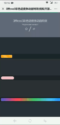
这是一款css3彩色进度条动画特效。该CSS3进度条动画特效中包含了三种动画特效,它们通过HMTL代码和简单的CSS3来实现彩色进度条的不同动画效果。
使用方法
HTML结构
<div class="container">
  <div class="progress progress-striped">
    <div class="progress-bar">
    </div>
  </div>
</div>

<div class="container">
  <div class="progress2 progress-moved">
    <div class="progress-bar2" >
    </div>
  </div>
</div>

<div class="container">
  <div class="progress progress-infinite">
    <div class="progress-bar3" >
    </div>
  </div>
</div>
CSS结构
body {
  font-family: 'Montserrat', sans-serif;
  background: #2c303a;
}

.container {
  margin: 100px auto;
  width: 500px;
  text-align: center;
}

.progress {
  padding: 6px;
  background: rgba(0, 0, 0, 0.25);
  border-radius: 6px;
  box-shadow: inset 0 1px 2px rgba(0, 0, 0, 0.25), 0 1px rgba(255, 255, 255, 0.08);
}

.progress-bar {
  height: 18px;
  background-color: #ee303c;
  border-radius: 4px;
  transition: 0.4s linear;
  transition-property: width, background-color;
}

.progress-striped .progress-bar {
  background-color: #FCBC51;
  width: 100%;
  background-image: linear-gradient(45deg, #fca311 25%, transparent 25%, transparent 50%, #fca311 50%, #fca311 75%, transparent 75%, transparent);
  animation: progressAnimationStrike 6s;
}

@keyframes progressAnimationStrike {
  from {
    width: 0;
  }
  to {
    width: 100%;
  }
}
.progress2 {
  padding: 6px;
  border-radius: 30px;
  background: rgba(0, 0, 0, 0.25);
  box-shadow: inset 0 1px 2px rgba(0, 0, 0, 0.25), 0 1px rgba(255, 255, 255, 0.08);
}

.progress-bar2 {
  height: 18px;
  border-radius: 30px;
  background-image: linear-gradient(to bottom, rgba(255, 255, 255, 0.3), rgba(255, 255, 255, 0.05));
  transition: 0.4s linear;
  transition-property: width, background-color;
}

.progress-moved .progress-bar2 {
  width: 85%;
  background-color: #EF476F;
  animation: progressAnimation 6s;
}

@keyframes progressAnimation {
  0% {
    width: 5%;
    background-color: #F9BCCA;
  }
  100% {
    width: 85%;
    background-color: #EF476F;
  }
}
.progress-bar3 {
  height: 18px;
  border-radius: 4px;
  background-image: linear-gradient(to right, #4cd964, #5ac8fa, #007aff, #7DC8E8, #5856d6, #ff2d55);
  transition: 0.4s linear;
  transition-property: width, background-color;
}

.progress-infinite .progress-bar3 {
  width: 100%;
  background-image: linear-gradient(to right, #4cd964, #5ac8fa, #007aff, #7DC8E8, #5856d6, #ff2d55);
  animation: colorAnimation 1s infinite;
}

@keyframes colorAnimation {
  0% {
    background-image: linear-gradient(to right, #4cd964, #5ac8fa, #007aff, #7DC8E8, #5856d6, #ff2d55);
  }
  20% {
    background-image: linear-gradient(to right, #5ac8fa, #007aff, #7DC8E8, #5856d6, #ff2d55, #4cd964);
  }
  40% {
    background-image: linear-gradient(to right, #007aff, #7DC8E8, #5856d6, #ff2d55, #4cd964, #5ac8fa);
  }
  60% {
    background-image: linear-gradient(to right, #7DC8E8, #5856d6, #ff2d55, #4cd964, #5ac8fa, #007aff);
  }
  100% {
    background-image: linear-gradient(to right, #5856d6, #ff2d55, #4cd964, #5ac8fa, #007aff, #7DC8E8);
  }
}
以上就是CSS3实现彩色进度条动画的示例的详细内容,更多关于CSS3 彩色进度条的资料请关注程序员之家其它相关文章!
相关文章
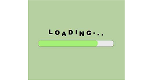 css3 keyframes制作创意有趣的进度条渐变加载动画,loading进度条动画特效,非常不错,喜欢的朋友快来下载吧2020-10-21
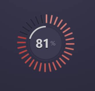 是一段基于jQuery+CSS3实现的双层圆环形状进度条加载动画特效,双层圆环中心还包含着数字百分比显示,非常不错,适应于所有网页使用,欢迎兴趣的朋友前来下载2020-08-17
 这篇文章主要介绍了利用css3实现进度条效果及动态添加百分比,文中通过示例代码介绍的非常详细,对大家的学习或者工作具有一定的参考学习价值,需要的朋友们下面随着小编来2020-06-01
 是一段基于CSS3实现的背景属性绘制渐变的进度条加载动画特效,自带有百分比加载动画效果,非常有意思,欢迎有兴趣的朋友前来下载使用2019-10-09
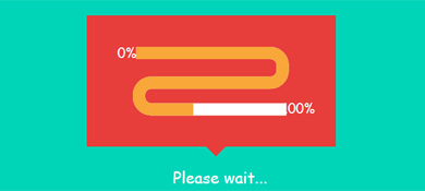 这是一款基于CSS3+SVG实现S形进度条加载动画效果源码。画面中一个类似蛇形管道的S形状进度条呈现出从左上方0%进度加载过渡到100%的进度。并如此循环往复2018-07-09
 这篇文章主要介绍了使用CSS3实现环形进度条效果,需要的朋友可以参考下2018-06-01
 jQuery基于css3属性制作红色的简易的下载按钮,用户点击download切换显示进度条加载动画,下载完成提示效果。有需要的朋友可以直接下载使用2018-04-04
 这篇文章主要介绍了css3 clip实现圆环进度条的示例代码的相关资料,小编觉得挺不错的,现在分享给大家,也给大家做个参考。一起跟随小编过来看看吧2018-02-07
 这篇文章主要介绍了css 进度条的文字根据进度渐变的示例代码,介绍了进度条里面的文字需要根据进度的长度而变化,小编觉得挺不错的,现在分享给大家,也给大家做个参考。一2018-01-09
 这是一个基于Bootstrap的纯CSS3进度条动画样式特效。具有阴影立体效果, 通过animation来制作,欢迎下载2017-10-23


最新评论