


纯CSS3实现漂亮的input输入框动画样式库(Text input love)
发布时间:2018-12-29 15:37:21 作者:程序员阿宇  我要评论
我要评论
我要评论本文分享一个用纯 CSS3 实现的,漂亮的 input 输入框动画样式库-Text input love。小编觉得挺不错的,现在分享给大家,也给大家做个参考。一起跟随小编过来看看吧
(福利推荐:你还在原价购买阿里云服务器?现在阿里云0.8折限时抢购活动来啦!4核8G企业云服务器仅2998元/3年,立即抢购>>>:9i0i.cn/aliyun)
分享一个用纯 CSS3 实现的,漂亮的 input 输入框动画样式库-Text input love。
点击每个输入框都用不同的动画效果,始终显示标签label,并显示 placeholder(占位符)文本。

演示地址:https://codepen.io/MichaelArestad/full/ohLIa
HTML 代码:
<div class="row">
  <p>Click every input.</p>
</div>
<div class="row">
  <span>
    <input class="basic-slide" id="name" type="text" placeholder="Your best name" /><label for="name">Name</label>
  </span>
  <span>
    <input class="basic-slide" id="email" type="text" placeholder="Your favorite email" /><label for="email">Email</label>
  </span>
  <span>
    <input class="basic-slide" id="phone" type="text" placeholder="You can trust us" /><label for="phone">Phone</label>
  </span>
</div>
<div class="row">
  <span>
    <input class="clean-slide" id="age" type="text" placeholder="Go for the high score!" /><label for="age">Age</label>
  </span>
  <span>
    <input class="clean-slide" id="height" type="text" placeholder="Heels count" /><label for="height">Height</label>
  </span>
  <span>
    <input class="clean-slide" id="weight" type="text" placeholder="Go ahead and lie" /><label for="weight">Weight</label>
  </span>
</div>
<div class="row">
  <span>
    <input class="gate" id="class" type="text" placeholder="Wizard!" /><label for="class">Class</label>
  </span>
  <span>
    <input class="gate" id="element" type="text" placeholder="Five to choose from" /><label for="element">Element</label>
  </span>
  <span>
    <input class="gate" id="move" type="text" placeholder="Secret book attack!" /><label for="move">Move</label>
  </span>
</div>
<div class="row">
  <span>
    <input class="skinny" id="english" type="text" placeholder="Do you speak it?" /><label for="english">English</label>
  </span>
  <span>
    <input class="skinny" id="burger" type="text" placeholder="A Royale with cheese?" /><label for="burger">Burger</label>
  </span>
  <span>
    <input class="skinny" id="wallet" type="text" placeholder="Bad Mother****er" /><label for="wallet">Wallet</label>
  </span>
</div>
<div class="row">
  <span>
    <input class="slide-up" id="card" type="text" placeholder="Fund me!" /><label for="card">Credit Card</label>
  </span>
  <span>
    <input class="slide-up" id="expires" type="text" placeholder="Month Day, Year" /><label for="expires">Expires</label>
  </span>
  <span>
    <input class="slide-up" id="security" type="text" placeholder="Public" /><label for="security">Security Code</label>
  </span>
</div>
<div class="row">
  <span>
    <input class="card-slide" id="knock" type="text" placeholder="Who's there?" /><label for="knock">Knock knock</label>
  </span>
  <span>
    <input class="card-slide" id="max" type="text" placeholder="Max who?" /><label for="max">Max</label>
  </span>
  <span>
    <input class="card-slide" id="out" type="text" placeholder="Sunuva..." /><label for="out">Maxed out card ;)</label>
  </span>
</div>
<div class="row">
  <span>
    <input class="swing" id="artist" type="text" placeholder="BO$$" /><label for="artist">Artist</label>
  </span>
  <span>
    <input class="swing" id="song" type="text" placeholder="I don't give a ****" /><label for="song">Song</label>
  </span>
  <span>
    <input class="swing" id="eyes" type="text" placeholder="Crazy" /><label for="eyes">Eyes</label>
  </span>
</div>
<div class="row">
  <span>
    <input class="balloon" id="state" type="text" placeholder="Liquid, solid, gaseous..." /><label for="state">State</label>
  </span>
  <span>
    <input class="balloon" id="planet" type="text" placeholder="Probably Earth" /><label for="planet">Planet</label>
  </span>
  <span>
    <input class="balloon" id="galaxy" type="text" placeholder="Milky Way?" /><label for="galaxy">Galaxy</label>
  </span>
</div>
SCSS 代码:
Sass 代码:
@import "compass/css3";

@import url(https://fonts.googleapis.com/css?family=Open+Sans:400,700,600,300,800);

* {
  box-sizing: border-box;
}
html,
body {
  overflow-x: hidden;
  font-family: "Open Sans", sans-serif;
  font-weight: 300;
  color: #fff;
  background: #efefef;
}
@mixin epic-sides() { // https://codepen.io/MichaelArestad/pen/qltuk
    position: relative;
    z-index: 1;

    &:before {
        position: absolute;
        content: "";
        display: block;
        top: 0;
        left: -5000px;
        height: 100%;
        width: 15000px;
        z-index: -1;
        @content;
    }
}
.row {
  max-width: 800px;
  margin: 0 auto;
  padding: 60px 30px;
  background: #032429;
  @include epic-sides() {background: inherit;}
  text-align: center;

  &:first-child {
    padding: 40px 30px;
  }
  &:nth-child(2),
  &:nth-child(8),
  &:nth-child(10){
    background: #134A46;
  }
  &:nth-child(3),
  &:nth-child(7) {
    background: #377D6A;
  }
  &:nth-child(4),
  &:nth-child(6) {
    background: #7AB893;
  }
  &:nth-child(5) {
    background: #B2E3AF;
  }

  span {
    position: relative;
    display: inline-block;
    margin: 30px 10px;
  }
}
.basic-slide {
  display: inline-block;
  width: 215px;
  padding: 10px 0 10px 15px;
  font-family: "Open Sans", sans;
  font-weight: 400;
  color: #377D6A;
  background: #efefef;
  border: 0;
  border-radius: 3px;
  outline: 0;
  text-indent: 70px; // Arbitrary.
  transition: all .3s ease-in-out;

  &::-webkit-input-placeholder {
    color: #efefef;
    text-indent: 0;
    font-weight: 300;
  }

  + label {
    display: inline-block;
    position: absolute;
    top: 0;
    left: 0;
    padding: 10px 15px;
    text-shadow: 0 1px 0 rgba(19,74,70,.4);
    background: #7AB893;
    transition: all .3s ease-in-out;
    border-top-left-radius: 3px;
    border-bottom-left-radius: 3px;
  }
}
.basic-slide:focus,
.basic-slide:active {
  color: #377D6A;
  text-indent: 0;
  background: #fff;
  border-top-left-radius: 0;
  border-bottom-left-radius: 0;

  &::-webkit-input-placeholder {
    color: #aaa;
  }
  + label {
    transform: translateX(-100%);
  }
}
.clean-slide {
  position: relative;
  display: inline-block;
  width: 215px;
  padding: 10px 0 10px 15px;
  font-family: "Open Sans", sans;
  font-weight: 400;
  color: #377D6A;
  background: #efefef;
  border: 0;
  border-radius: 3px;
  outline: 0;
  text-indent: 60px; // Arbitrary.
  transition: all .3s ease-in-out;

  &::-webkit-input-placeholder {
    color: #efefef;
    text-indent: 0;
    font-weight: 300;
  }

  + label {
    display: inline-block;
    position: absolute;
    transform: translateX(0);
    top: 0;
    left: 0;
    bottom: 0;
    padding: 13px 15px;
    font-size: 11px;
    font-weight: 700;
    text-transform: uppercase;
    color: #032429;
    text-align: left;
    text-shadow: 0 1px 0 rgba(255,255,255,.4);
    transition: all .3s ease-in-out, color .3s ease-out;
    border-top-left-radius: 3px;
    border-bottom-left-radius: 3px;
    overflow: hidden;

    &:after {
      content: "";
      position: absolute;
      top: 0;
      right: 100%;
      bottom: 0;
      width: 100%;
      background: #7AB893;
      z-index: -1;
      transform: translate(0);
      transition: all .3s ease-in-out;
      border-top-left-radius: 3px;
      border-bottom-left-radius: 3px;
    }
  }
}
.clean-slide:focus,
.clean-slide:active {
  color: #377D6A;
  text-indent: 0;
  background: #fff;
  border-top-left-radius: 0;
  border-bottom-left-radius: 0;

  &::-webkit-input-placeholder {
    color: #aaa;
  }
  + label {
    color: #fff;
    text-shadow: 0 1px 0 rgba(19,74,70,.4);
    transform: translateX(-100%);

    &:after {
      transform: translate(100%);
    }
  }
}
.gate {
  display: inline-block;
  width: 215px;
  padding: 10px 0 10px 15px;
  font-family: "Open Sans", sans;
  font-weight: 400;
  color: #377D6A;
  background: #efefef;
  border: 0;
  border-radius: 3px;
  outline: 0;
  text-indent: 65px; // Arbitrary.
  transition: all .3s ease-in-out;

  &::-webkit-input-placeholder {
    color: #efefef;
    text-indent: 0;
    font-weight: 300;
  }

  + label {
    display: inline-block;
    position: absolute;
    top: 0;
    left: 0;
    padding: 10px 15px;
    text-shadow: 0 1px 0 rgba(19,74,70,.4);
    background: #7AB893;
    transition: all .4s ease-in-out;
    border-top-left-radius: 3px;
    border-bottom-left-radius: 3px;
    transform-origin: left bottom;
    z-index: 99;

    &:before,
    &:after {
      content: "";
      position: absolute;
      top: 0;
      right: 0;
      bottom: 0;
      left: 0;
      border-radius: 3px;
      background: #377D6A;
      transform-origin: left bottom;
      transition: all .4s ease-in-out;
      pointer-events: none;
      z-index: -1;
    }
    &:before {
      background: rgba(3,36,41,.2);
      z-index: -2;
      right: 20%;
    }
  }
}
span:nth-child(2) .gate {
  text-indent: 85px;
}
span:nth-child(2) .gate:focus,
span:nth-child(2) .gate:active{
  text-indent: 0;
}
.gate:focus,
.gate:active {
  color: #377D6A;
  text-indent: 0;
  background: #fff;
  border-top-right-radius: 3px;
  border-bottom-right-radius: 3px;

  &::-webkit-input-placeholder {
    color: #aaa;
  }
  + label {
    transform: rotate(-66deg);
    border-radius: 3px;

    &:before {
      transform: rotate(10deg);
    }
  }
}
.skinny {
  display: inline-block;
  width: 215px;
  padding: 10px 0 10px 15px;
  font-family: "Open Sans", sans;
  font-weight: 400;
  color: #377D6A;
  background: #efefef;
  border: 0;
  border-radius: 3px;
  outline: 0;
  text-indent: 75px; // Arbitrary.
  transition: all .3s ease-in-out;

  &::-webkit-input-placeholder {
    color: #efefef;
    text-indent: 0;
    font-weight: 300;
  }

  + label {
    display: inline-block;
    position: absolute;
    transform: translateX(0);
    top: 0;
    left: 0;
    padding: 10px 15px;
    text-shadow: 0 1px 0 rgba(19,74,70,.4);
    transition: all .3s ease-in-out;
    border-top-left-radius: 3px;
    border-bottom-left-radius: 3px;
    overflow: hidden;

    &:before,
    &:after {
      content: "";
      position: absolute;
      right: 0;
      left: 0;
      z-index: -1;
      transition: all .3s ease-in-out;
    }
    &:before {
      // Skinny bit here
      top: 5px;
      bottom: 5px;
      background: #377D6A; // change this to #134A46
      border-top-left-radius: 3px;
      border-bottom-left-radius: 3px;
    }
    &:after {
      top: 0;
      bottom: 0;
      background: #377D6A;
    }
  }
}
.skinny:focus,
.skinny:active {
  color: #377D6A;
  text-indent: 0;
  background: #fff;

  &::-webkit-input-placeholder {
    color: #aaa;
  }
  + label {
    transform: translateX(-100%);

    &:after {
      transform: translateX(100%);
    }
  }
}
.slide-up {
  display: inline-block;
  width: 215px;
  padding: 10px 0 10px 15px;
  font-family: "Open Sans", sans;
  font-weight: 400;
  color: #377D6A;
  background: #efefef;
  border: 0;
  border-radius: 3px;
  outline: 0;
  text-indent: 80px; // Arbitrary.
  transition: all .3s ease-in-out;

  &::-webkit-input-placeholder {
    color: #efefef;
    text-indent: 0;
    font-weight: 300;
  }

  + label {
    display: inline-block;
    position: absolute;
    transform: translateX(0);
    top: 0;
    left: 0;
    padding: 10px 15px;
    text-shadow: 0 1px 0 rgba(19,74,70,.4);
    transition: all .3s ease-in-out;
    border-top-left-radius: 3px;
    border-bottom-left-radius: 3px;
    overflow: hidden;

    &:before,
    &:after {
      content: "";
      position: absolute;
      right: 0;
      left: 0;
      z-index: -1;
      transition: all .3s ease-in-out;
    }
    &:before {
      // Skinny bit here
      top: 6px;
      left: 5px;
      right: 5px;
      bottom: 6px;
      background: #377D6A; // change this to #134A46
    }
    &:after {
      top: 0;
      bottom: 0;
      background: #377D6A;
    }
  }
}
span:nth-child(1) .slide-up {
  text-indent: 105px;
}
span:nth-child(3) .slide-up {
  text-indent: 125px;
}
span:nth-child(1) .slide-up:focus,
span:nth-child(1) .slide-up:active,
span:nth-child(3) .slide-up:focus,
span:nth-child(3) .slide-up:active {
  text-indent: 0;
}
.slide-up:focus,
.slide-up:active {
  color: #377D6A;
  text-indent: 0;
  background: #fff;

  &::-webkit-input-placeholder {
    color: #aaa;
  }
  + label {
    transform: translateY(-100%);

    &:before {
      border-radius: 5px;
    }
    &:after {
      transform: translateY(100%);
    }
  }
}
.card-slide {
  display: inline-block;
  width: 215px;
  padding: 10px 0 10px 15px;
  font-family: "Open Sans", sans;
  font-weight: 400;
  color: #377D6A;
  background: #efefef;
  border: 0;
  border-radius: 3px;
  outline: 0;
  text-indent: 115px; // Arbitrary.
  transition: all .3s ease-in-out;

  &::-webkit-input-placeholder {
    color: #efefef;
    text-indent: 0;
    font-weight: 300;
  }

  + label {
    display: block;
    position: absolute;
    top: 0;
    left: 0;
    padding: 10px 15px;
    text-shadow: 0 1px 0 rgba(19,74,70,.4);
    background: #7AB893;
    transition: all .3s ease-in-out;
    border-top-left-radius: 3px;
    border-bottom-left-radius: 3px;
    transform-origin: right center;
    transform: perspective(300px) scaleX(1) rotateY(0deg);
  }
}
span:nth-child(2) .card-slide {
  text-indent: 55px;
}
span:nth-child(3) .card-slide {
  text-indent: 150px;
}
span:nth-child(2) .card-slide:focus,
span:nth-child(2) .card-slide:active,
span:nth-child(3) .card-slide:focus,
span:nth-child(3) .card-slide:active {
  text-indent: 0;
}
.card-slide:focus,
.card-slide:active {
  color: #377D6A;
  text-indent: 0;
  background: #fff;
  border-top-left-radius: 0;
  border-bottom-left-radius: 0;

  &::-webkit-input-placeholder {
    color: #aaa;
  }
  + label {
    transform: perspective(600px) translateX(-100%) rotateY(80deg);
  }
}
.swing {
  display: inline-block;
  width: 215px;
  padding: 10px 0 10px 15px;
  font-family: "Open Sans", sans;
  font-weight: 400;
  color: #377D6A;
  background: #efefef;
  border: 0;
  border-radius: 3px;
  outline: 0;
  text-indent: 60px; // Arbitrary.
  transition: all .3s ease-in-out;

  &::-webkit-input-placeholder {
    color: #efefef;
    text-indent: 0;
    font-weight: 300;
  }

  + label {
    display: inline-block;
    position: absolute;
    top: 0;
    left: 0;
    padding: 10px 15px;
    text-shadow: 0 1px 0 rgba(19,74,70,.4);
    background: #7AB893;
    border-top-left-radius: 3px;
    border-bottom-left-radius: 3px;
    transform-origin: 2px 2px;
    transform: rotate(0);
    // There should be a better way
    animation: swing-back .4s 1 ease-in-out;
  }
}
@keyframes swing {
  0% {
    transform: rotate(0);
  }
  20% {
    transform: rotate(116deg);
  }
  40% {
    transform: rotate(60deg);
  }
  60% {
    transform: rotate(98deg);
  }
  80% {
    transform: rotate(76deg);
  }
  100% {
    transform: rotate(82deg);
  }
}
@keyframes swing-back {
  0% {
    transform: rotate(82deg);
  }
  100% {
    transform: rotate(0);
  }
}
.swing:focus,
.swing:active {
  color: #377D6A;
  text-indent: 0;
  background: #fff;
  border-top-left-radius: 0;
  border-bottom-left-radius: 0;

  &::-webkit-input-placeholder {
    color: #aaa;
  }
  + label {
    animation: swing 1.4s 1 ease-in-out;
    transform: rotate(82deg);
  }
}
.balloon {
  // As suggested by https://twitter.com/dbox/status/365888496486985728
  display: inline-block;
  width: 215px;
  padding: 10px 0 10px 15px;
  font-family: "Open Sans", sans;
  font-weight: 400;
  color: #377D6A;
  background: #efefef;
  border: 0;
  border-radius: 3px;
  outline: 0;
  text-indent: 60px; // Arbitrary.
  transition: all .3s ease-in-out;

  &::-webkit-input-placeholder {
    color: #efefef;
    text-indent: 0;
    font-weight: 300;
  }

  + label {
    display: inline-block;
    position: absolute;
    top: 8px;
    left: 0;
    bottom: 8px;
    padding: 5px 15px;
    color: #032429;
    font-size: 11px;
    font-weight: 700;
    text-transform: uppercase;
    text-shadow: 0 1px 0 rgba(19,74,70,0);
    transition: all .3s ease-in-out;
    border-radius: 3px;
    background: rgba(122,184,147,0);

    &:after {
      position: absolute;
      content: "";
      width: 0;
      height: 0;
      top: 100%;
      left: 50%;
      margin-left: -3px;
      border-left: 3px solid transparent;
      border-right: 3px solid transparent;
      border-top: 3px solid rgba(122,184,147,0);
      transition: all .3s ease-in-out;
    }
  }
}
.balloon:focus,
.balloon:active {
  color: #377D6A;
  text-indent: 0;
  background: #fff;

  &::-webkit-input-placeholder {
    color: #aaa;
  }
  + label {
    color: #fff;
    text-shadow: 0 1px 0 rgba(19,74,70,.4);
    background: rgba(122,184,147,1);
    transform: translateY(-40px);

    &:after {
      border-top: 4px solid rgba(122,184,147,1);
    }
  }
}
以上就是本文的全部内容,希望对大家的学习有所帮助,也希望大家多多支持程序员之家。
相关文章
 这篇文章主要介绍了HTML中利用div+CSS实现简单的箭头图标的代码,需要的朋友可以参考下2019-07-24
- 这篇文章主要介绍了css 11种方法实现一个tips带有描边的小箭头,文中通过示例代码介绍的非常详细,对大家的学习或者工作具有一定的参考学习价值,需要的朋友们下面随着小编2019-02-21
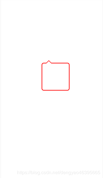
 这篇文章主要介绍了css实现带箭头和圆点的轮播的相关资料,当鼠标移入图片、圆点和方向键时,停止轮播,移除恢复。具有一定的参考价值,感兴趣的小伙伴们可以参考一下2018-08-28
- 这篇文章主要介绍了一款可自定义箭头样式的CSS3气泡提示框,CSS气泡提示框由纯CSS完成,最大的特点就是可以自定义配置,包括文字颜色、背景颜色和箭头方向等,想要拥有这款2016-03-16
 一款基于纯CSS的气泡提示框,最大的特点就是可以自定义配置,包括文字颜色、背景颜色和箭头方向等2016-03-16
- 这篇文章主要为大家介绍了基于CSS实现带阴影和小箭头的黑色风格下拉菜单效果,涉及使用css响应hover样式实现下拉菜单效果的相关技巧,界面美观大方,具有一定参考借鉴价值,需2015-09-10
- 这篇文章主要为大家介绍了CSS实现让同一行文字和输入框对齐的方法,涉及css中vertical-align属性的使用技巧,需要的朋友可以参考下2015-05-12
- 这篇主要介绍HTML带表情的评论框,表情通过Json数据加载,可以根据自己的喜好改变表情。本评论框代码为HTML,CSS,JQ三个方面的代码,html的代码还是比较简单的,大家可以2014-11-05
 我们在很多UI框架中看到带箭头的提示框,感觉挺漂亮,今天小编通过实例代码给大家介绍CSS实现带箭头的提示框效果,感兴趣的朋友一起看看吧2019-10-15


最新评论