


css中position:sticky 粘性定位详解
 我要评论
我要评论(福利推荐:你还在原价购买阿里云服务器?现在阿里云0.8折限时抢购活动来啦!4核8G企业云服务器仅2998元/3年,立即抢购>>>:9i0i.cn/aliyun)
1、什么是粘性定位?
粘性定位它基于用户的滚动位置来定位。
粘性定位的元素是依赖于用户的滚动,在 position:relative 与 position:fixed 定位之间切换。
它的行为就像 position:relative; 而当页面滚动超出目标区域时,它的表现就像 position:fixed;,它会固定在目标位置。
注意: Internet Explorer, Edge 15 及更早 IE 版本不支持 sticky 定位。 Safari 需要使用 -webkit- prefix
例如:
div.sticky {
    position: -webkit-sticky; /* Safari */
    position: sticky;
    top: 10px;
}
设置了以上元素,在屏幕范围(viewport)视口滚动到元素top距离小于10px之前,div为相对定位。之后元素将固定在与顶部距离10px的位置,直到viewport视口回滚到10px以内。
特点:
- 元素定位表现为在跨越特定阈值前为相对定位,之后为固定定位。
- 这个特定阈值指的是 top, right, bottom 或 left 之一,换言之,指定 top, right, bottom 或 left 四个阈值其中之一,才可使粘性定位生效。否则其行为与相对定位相同。
- 偏移值不会影响任何其他元素的位置。该值总是创建一个新的层叠上下文(stacking context)。
- sticky元素会固定在离它最近的一个拥有滚动机制的祖先上,如果祖先元素都不可以滚动,那么是相对于viewport来计算元素的偏移量。
2、原理
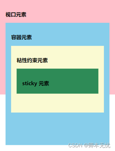
视口元素:显示内容的区域。会设置宽高。一般会设置 overflow:hidden。
容器元素:离 sticky 元素最近的能滚动的祖先元素。
粘性约束元素:粘性定位的父元素。有时也会出现粘性约束元素就是容器元素的情况。
sticky 元素:设置了 position: sticky; 的元素。
滚动时,sticky 元素设置的 left, right, top, bottom 的值相对的是容器元素。当粘性约束元素滚出视口时,sticky 元素也会滚出视口。
3、可能存在的不生效的情况
3.1 未指定 top, right, top 和 bottom 中的任何一个值
此时,设置 position: sticky 相当于设置 position: relative。
要生效,要指定 top, right, top 或 bottom 中的任何一个值。
3.2 垂直滚动时,粘性约束元素高度小于等于 sticky 元素高度
当粘性约束元素滚出视口时,sticky 元素也会滚出视口。粘性约束元素比 sticky 元素还小,sticky 元素没有显示固定定位状态的机会。
水平滚动时,粘性约束元素宽度小于等于 sticky 元素宽度时,也不会生效。
3.3 粘性约束元素和容器元素之间存在 overflow: hidden 的元素
示例如下:
<!DOCTYPE html>
<html lang="en">
	<head>
		<meta charset="UTF-8">
		<meta http-equiv="X-UA-Compatible" content="IE=edge">
		<meta name="viewport" content="width=device-width, initial-scale=1.0">
		<title>Document</title>
		<style>
			body {
				margin: 0;
				padding: 0;
			}
			.viewport {
				width: 375px;
				height: 300px;
				background-color: pink;
				padding: 20px;
				overflow: auto;
			}
			.container {
				height: 500px;
				background-color: skyblue;
				padding: 20px;
			}
			.box {
				height: 300px;
				background-color: lightgoldenrodyellow;
				padding: 20px;
			}
			.stick-elem {
				height: 50px;
				background-color: seagreen;
				padding: 20px;
				position: -webkit-sticky;
				position: sticky;
				top: 50px;
			}
		</style>
	</head>
	<body>
		<!-- 视口元素 -->
		<div class="viewport">
			<h3>视口元素</h3>
			<!-- 容器元素 -->
			<div class="container">
				<h3>容器元素</h3>
				<div style="overflow: hidden;">
					<!-- 粘性约束元素 -->
					<div class="box">
						<h3>粘性约束元素</h3>
						<!-- sticky 元素 -->
						<div class="stick-elem">
							<h3>sticky 元素</h3>
						</div>
					</div>
				</div>
			</div>
		</div>
	</body>
</html>
4、应用示例
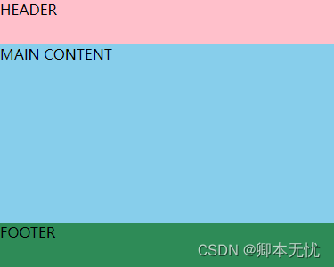
4.1 头部固定
头部导航栏开始时相对定位顶部,当页面元素发生滚动时,变为和 fixed 类似的固定定位。

<!DOCTYPE html>
<html lang="en">
	<head>
		<meta charset="UTF-8">
		<meta http-equiv="X-UA-Compatible" content="IE=edge">
		<meta name="viewport" content="width=device-width, initial-scale=1.0">
		<title>Document</title>
		<style>
			body {
				margin: 0;
				padding: 0;
			}
			.main-container {
				max-width: 375px;
				height: 300px;
				overflow: auto;
			}
			.main-header {
				height: 50px;
				background: pink;
				position: -webkit-sticky;
				position: sticky;
				top: 0;
			}
			.main-content {
				min-height: 500px;
				background: skyblue;
			}
			.main-footer {
                height: 50px;
				background: seagreen;
			}
		</style>
	</head>
	<body>
		<main class="main-container">
			<header class="main-header">HEADER</header>
			<div class="main-content">MAIN CONTENT</div>
			<footer class="main-footer">FOOTER</footer>
		</main>
	</body>
</html>
4.2 页脚固定
页脚固定效果,开始时页脚为固定定位效果,当页面滚动超过页脚时,页脚定位效果变为相对定位效果,可用于显示一些底部信息或广告。
<!DOCTYPE html>
<html lang="en">
	<head>
		<meta charset="UTF-8">
		<meta http-equiv="X-UA-Compatible" content="IE=edge">
		<meta name="viewport" content="width=device-width, initial-scale=1.0">
		<title>Document</title>
		<style>
			body {
				margin: 0;
				padding: 0;
			}
			.main-container {
				max-width: 375px;
				height: 300px;
				overflow: auto;
			}
			.main-header {
				height: 50px;
				background: pink;
				position: -webkit-sticky;
			}
			.main-content {
				min-height: 500px;
				background: skyblue;
			}
			.main-footer {
				height: 50px;
				background: seagreen;
				position: sticky;
				bottom: 0;
			}
		</style>
	</head>
	<body>
		<main class="main-container">
			<header class="main-header">HEADER</header>
			<div class="main-content">MAIN CONTENT</div>
			<footer class="main-footer">FOOTER</footer>
		</main>
	</body>
</html>
4.3 侧边栏固定
当页面产生滚动,位置超过侧边栏的 顶部阈值 后,侧边栏变为固定定位,可用于实现侧边导航栏或侧边提示信息及广告展示。

<!DOCTYPE html>
<html lang="en">
<head>
<meta charset="UTF-8">
<meta http-equiv="X-UA-Compatible" content="IE=edge">
<meta name="viewport" content="width=device-width, initial-scale=1.0">
<title>Document</title>
<style>
body {
margin: 0;
padding: 0;
}
.scroll {
width: 375px;
height: 300px;
overflow: scroll;
padding: 0 10px;
box-sizing: border-box;
background: pink;
}
.wrapper {
display: flex;
}
.content {
padding: 0 15px;
width: 200px;
}
.sidebar {
width: 175px;
height: 100%;
padding: 20px;
background: #2D2D2D;
color: #FFFFFF;
box-sizing: border-box;
position: -webkit-sticky;
position: sticky;
top: 15px;
}
</style>
</head>
<body>
<div class="scroll">
<div class="wrapper">
<div class="content">
<h1>Scroll Down!</h1>
<p>Pellentesque habitant morbi tristique senectus et netus et malesuada fames ac turpis egestas.
Vestibulum tortor quam, feugiat vitae, ultricies eget, tempor sit amet, ante. Donec eu libero
sit amet quam egestas semper. Aenean ultricies mi vitae est. Mauris placerat eleifend leo.</p>
<p>Lorem ipsum dolor sit amet, consectetur adipisicing elit. Minus suscipit blanditiis delectus
quos, soluta fuga voluptatem, facere inventore neque voluptate quaerat unde laboriosam molestiae
repellat, sapiente accusamus cumque! Ipsam, illo!</p>
</div>
<div class="sidebar">
<h3>侧边栏</h3>
</div>
</div>
</div>
</body>
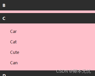
</html>4.4 列表描点
仅使用 css 就可实现页面滚动锚点固定效果,可用于实现通讯录滚动、日志记录滚动、其他分类列表滚动效果。
<!DOCTYPE html>
<html lang="en">
	<head>
		<meta charset="UTF-8">
		<meta http-equiv="X-UA-Compatible" content="IE=edge">
		<meta name="viewport" content="width=device-width, initial-scale=1.0">
		<title>Document</title>
		<style>
			body {
				margin: 0;
				padding: 0;
			}
			.container {
				width: 375px;
				height: 300px;
				position: relative;
				overflow: auto;
			}
			.list {
				min-height: 500px;
				background: pink;
			}
			.list-content,
			.list-content>div {
				padding: 10px 20px;
			}
			.list-header {
				padding: 10px;
				background: #2D2D2D;
				color: #FFFFFF;
				font-weight: bold;
				position: sticky;
				top: 0;
			}
		</style>
	</head>
	<body>
		<div class="container">
			<div class="list">
				<div class="list-group">
					<div class="list-header">A</div>
					<div class="list-content">
						<div>Apple</div>
						<div>Artichoke</div>
						<div>Aardvark</div>
						<div>Ant</div>
						<div>Acorn</div>
					</div>
				</div>
				<div class="list-group">
					<div class="list-header">B</div>
					<div class="list-content">
						<div>Big</div>
						<div>Body</div>
						<div>Base</div>
						<div>Baby</div>
						<div>But</div>
					</div>
				</div>
				<div class="list-group">
					<div class="list-header">C</div>
					<div class="list-content">
						<div>Car</div>
						<div>Cat</div>
						<div>Cute</div>
						<div>Can</div>
					</div>
				</div>
				<div class="list-group">
					<div class="list-header">D</div>
					<div class="list-content">
						<div>Dog</div>
						<div>Date</div>
						<div>Danish</div>
						<div>Dandelion</div>
					</div>
				</div>
			</div>
		</div>
	</body>
</html>
4.5 表格表头固定
对 table 元素的 th 或 tr 设置 position: sticky; 可以实现表格头部或某行固定,也可将多个表格合并到一起,当滚动到当前表格是,固定头部自动变为当前表格的表头。

<!DOCTYPE html>
<html lang="en">
	<head>
		<meta charset="UTF-8">
		<meta http-equiv="X-UA-Compatible" content="IE=edge">
		<meta name="viewport" content="width=device-width, initial-scale=1.0">
		<title>Document</title>
		<style>
			body {
				margin: 0;
				padding: 0;
			}
			.container {
				width: 375px;
				height: 300px;
				width: fit-content;
				overflow: auto;
			}
			table {
				text-align: left;
				position: relative;
				border-collapse: collapse;
			}
			th,
			td {
				padding: 30px 17px;
			}
			tr:nth-child(even) {
				background: #EFEFEF;
			}
			tr.red th {
				background: #dd4a63;
				color: white;
			}
			tr.green th {
				background: #03C03C;
				color: white;
			}
			tr.blue th {
				background: #1580d8;
				color: white;
			}
			th {
				background: white;
				position: sticky;
				top: 0;
			}
		</style>
	</head>
	<body>
		<div class="container">
			<table>
				<thead>
					<tr class="red">
						<th>Name</th>
						<th>Age</th>
						<th>Job</th>
						<th>Color</th>
						<th>URL</th>
					</tr>
				</thead>
				<tbody>
					<tr>
						<td>Lorem.</td>
						<td>Ullam.</td>
						<td>Vel.</td>
						<td>At.</td>
						<td>Quis.</td>
					</tr>
					<tr>
						<td>Lorem.</td>
						<td>Ullam.</td>
						<td>Vel.</td>
						<td>At.</td>
						<td>Quis.</td>
					</tr>
					<tr>
						<td>Lorem.</td>
						<td>Ullam.</td>
						<td>Vel.</td>
						<td>At.</td>
						<td>Quis.</td>
					</tr>
					<tr class="green">
						<th>Name</th>
						<th>Age</th>
						<th>Job</th>
						<th>Color</th>
						<th>URL</th>
					</tr>
					<tr>
						<td>Lorem.</td>
						<td>Ullam.</td>
						<td>Vel.</td>
						<td>At.</td>
						<td>Quis.</td>
					</tr>
					<tr>
						<td>Lorem.</td>
						<td>Ullam.</td>
						<td>Vel.</td>
						<td>At.</td>
						<td>Quis.</td>
					</tr>
					<tr class="blue">
						<th>Name</th>
						<th>Age</th>
						<th>Job</th>
						<th>Color</th>
						<th>URL</th>
					</tr>
					<tr>
						<td>Lorem.</td>
						<td>Ullam.</td>
						<td>Vel.</td>
						<td>At.</td>
						<td>Quis.</td>
					</tr>
					<tr>
						<td>Lorem.</td>
						<td>Ullam.</td>
						<td>Vel.</td>
						<td>At.</td>
						<td>Quis.</td>
					</tr>
					<tr>
						<td>Lorem.</td>
						<td>Ullam.</td>
						<td>Vel.</td>
						<td>At.</td>
						<td>Quis.</td>
					</tr>
				</tbody>
			</table>
		</div>
	</body>
</html>
4.6 页面进度条(简易)
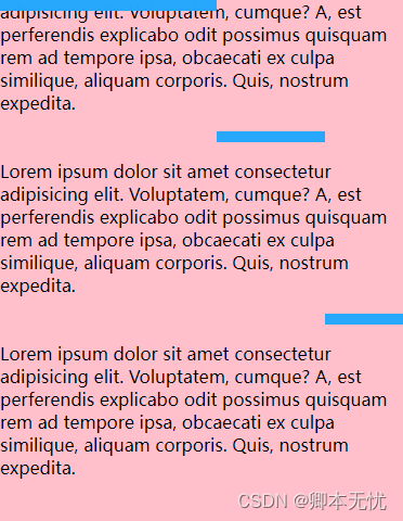
利用 position: sticky; 定位,可以实现页面浏览进度条效果,以下是简易进度条的演示,实际实现中可将未滚动到顶部的元素设置为透明色,滚动到顶部时变为蓝色。
<!DOCTYPE html>
<html lang="en">
	<head>
		<meta charset="UTF-8">
		<meta http-equiv="X-UA-Compatible" content="IE=edge">
		<meta name="viewport" content="width=device-width, initial-scale=1.0">
		<title>Document</title>
		<style>
			body {
				margin: 0;
				padding: 0;
			}
			.container {
				width: 400px;
				height: 300px;
				overflow: auto;
				padding-bottom: 500px;
				box-sizing: border-box;
				background: pink;
			}
			.sticky {
				width: 100px;
				height: 10px;
				background: rgba(36, 167, 254, 0.979);
				position: -webkit-sticky;
				position: sticky;
				top: 0;
			}
			.sticky:nth-of-type(2) {
				transform: translateX(100px);
			}
			.sticky:nth-of-type(3) {
				transform: translateX(200px);
			}
			.sticky:nth-of-type(4) {
				transform: translateX(300px);
			}
		</style>
	</head>
	<body>
		<div class="container">
			<h1>Sticky Progress</h1>
			<div class="sticky"></div>
			<p>Lorem ipsum dolor sit amet consectetur adipisicing elit. Voluptatem, cumque? A, est perferendis explicabo
				odit possimus quisquam rem ad tempore ipsa, obcaecati ex culpa similique, aliquam corporis. Quis,
				nostrum expedita.</p>
			<div class="sticky"></div>
			<p>Lorem ipsum dolor sit amet consectetur adipisicing elit. Voluptatem, cumque? A, est perferendis explicabo
				odit possimus quisquam rem ad tempore ipsa, obcaecati ex culpa similique, aliquam corporis. Quis,
				nostrum expedita.</p>
			<div class="sticky"></div>
			<p>Lorem ipsum dolor sit amet consectetur adipisicing elit. Voluptatem, cumque? A, est perferendis explicabo
				odit possimus quisquam rem ad tempore ipsa, obcaecati ex culpa similique, aliquam corporis. Quis,
				nostrum expedita.</p>
			<div class="sticky"></div>
			<p>Lorem ipsum dolor sit amet consectetur adipisicing elit. Voluptatem, cumque? A, est perferendis explicabo
				odit possimus quisquam rem ad tempore ipsa, obcaecati ex culpa similique, aliquam corporis. Quis,
				nostrum expedita.</p>
		</div>
	</body>
</html>到此这篇关于position:sticky 粘性定位的文章就介绍到这了,更多相关position:sticky 粘性定位内容请搜索程序员之家以前的文章或继续浏览下面的相关文章,希望大家以后多多支持程序员之家!
相关文章
 这篇文章主要介绍了position:sticky 粘性定位的几种巧妙应用详解,文中通过示例代码介绍的非常详细,对大家的学习或者工作具有一定的参考学习价值,需要的朋友们下面随着小2021-04-23
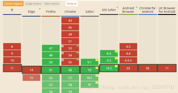 这篇文章主要介绍了详解css粘性定位position:sticky问题采坑的相关资料,文中通过示例代码介绍的非常详细,对大家的学习或者工作具有一定的参考学习价值,需要的朋友们下2019-08-26
 本文主要介绍了CSS中Position:Sticky不起作用的问题解决,包含了5种不生效的方法,文中通过示例代码介绍的非常详细,对大家的学习或者工作具有一定的参考学习价值,需要的2024-02-18
用position:sticky完美解决小程序吸顶问题的实现方法
这篇文章主要介绍了用position:sticky完美解决小程序吸顶问题的实现方法,文中通过示例代码介绍的非常详细,对大家的学习或者工作具有一定的参考学习价值,需要的朋友们下2021-04-23
CSS使用position:sticky 实现粘性布局的方法
这篇文章主要介绍了CSS使用position:sticky 实现粘性布局的方法的相关资料,小编觉得挺不错的,现在分享给大家,也给大家做个参考。一起跟随小编过来看看吧2018-01-31- 用户的屏幕越来越大,而页面太宽的话会不宜阅读,所以绝大部分网站的主体宽度和之前相比没有太大的变化,于是浏览器中就有越来越多的空白区域,所以你可能注意到很多网站开2012-12-25


最新评论