


css弧边选项卡的项目实践
发布时间:2023-05-05 15:22:40 作者: Agony95z  我要评论
我要评论
我要评论本文主要介绍了css弧边选项卡的项目实践,文中通过示例代码介绍的非常详细,对大家的学习或者工作具有一定的参考学习价值,需要的朋友们下面随着小编来一起学习学习吧
(福利推荐:你还在原价购买阿里云服务器?现在阿里云0.8折限时抢购活动来啦!4核8G企业云服务器仅2998元/3年,立即抢购>>>:9i0i.cn/aliyun)
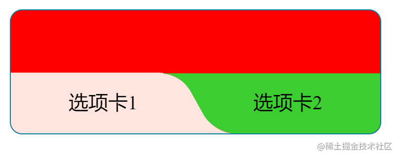
实现效果
实现方式
主要使用了
等属性
思路
只需要想清楚如何实现弧形三角即可。这里还是借助了渐变 -- 径向渐变

其实他是这样,如下图所示,我们只需要把黑色部分替换为透明即可,使用两个伪元素即可:

通过超出隐藏和旋转得到想要的效果


综上
在上述 outside-circle 的图形基础上:
- 设置一个适当的
perspective值 - 设置一个恰当的旋转圆心
transform-origin - 绕 X 轴进行旋转动图演示

代码
<!DOCTYPE html>
<html lang="en">
<head>
  <meta charset="UTF-8">
  <meta http-equiv="X-UA-Compatible" content="IE=edge">
  <meta name="viewport" content="width=device-width, initial-scale=1.0">
  <title>Document</title>
</head>
<style>
  .g-container {
    position: relative;
    width: 300px;
    height: 100px;
    background: red;
    border: 1px solid #277f9e;
    border-radius: 10px;
    overflow: hidden;
}
.g-inner {
    position: absolute;
    width: 150px;
    height: 50px;
    background: #fee6e0;
    bottom: 0;
    border-radius: 0 20px 0 20px;
    transform: perspective(40px) scaleX(1.4) scaleY(1.5) rotateX(20deg) translate(-10px, 0);
    transform-origin: 50% 100%;
}
.g-inner::before {
    content: "";
    position: absolute;
    right: -10px;
    width: 10px;
    height: 10px;
    top: 40px;
    background: radial-gradient(circle at 100% 0, transparent, transparent 9.5px, #fee6e0 10px, #fee6e0);
}
.g-after {
    position: absolute;
    width: 150px;
    height: 50px;
    background: #6ecb15;
    bottom: 49px;
    right: 0;
    border-radius: 20px 0 20px 0;
    transform: perspective(40px) scaleX(1.4) scaleY(-1.5) rotateX(20deg) translate(14px, 0);
    transform-origin: 53% 100%;
}
.g-after::before {
    content: "";
    position: absolute;
    left: -10px;
    top: 40px;
    width: 10px;
    height: 10px;
    background: radial-gradient(circle at 0 0, transparent, transparent 9.5px, #6ecb15 10px, #6ecb15);
}
.g-inner-text,.g-after-text {
  position: absolute;
  width: 150px;
  height: 50px;
  line-height: 50px;
  text-align: center;
}
.g-inner-text {
  top: 50%;
  left: 0;
}
.g-after-text {
  top: 50%;
  right: 0;
}
</style>
<body>
  <div class="g-container">
    <div class="g-inner"></div>
    <div class="g-after"></div>
    <div class="g-inner-text">选项卡1</div>
    <div class="g-after-text">选项卡2</div>
  </div>
</body>
</html>
参考文章:https://github.com/chokcoco/iCSS/issues/224
到此这篇关于css弧边选项卡的项目实践的文章就介绍到这了,更多相关css弧边选项卡内容请搜索程序员之家以前的文章或继续浏览下面的相关文章,希望大家以后多多支持程序员之家!
相关文章
 这篇文章主要介绍了css3 实现元素弧线运动的示例代码,文中通过示例代码介绍的非常详细,对大家的学习或者工作具有一定的参考学习价值,需要的朋友们下面随着小编来一起学2020-04-24
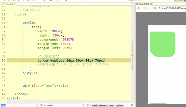 这篇文章主要介绍了使用CSS的border-radius属性 设置圆弧,本文通过实例代码给大家介绍的非常详细,具有一定的参考借鉴价值,需要的朋友可以参考下2019-11-26
 这篇文章主要介绍了详解canvas在圆弧周围绘制文本的两种写法,直接按弧度进行编写的,小编觉得挺不错的,现在分享给大家,也给大家做个参考。一起跟随小编过来看看吧2018-05-22
 本篇文章主要介绍了css3实现画半圆弧线的示例代码,小编觉得挺不错的,现在分享给大家,也给大家做个参考。一起跟随小编过来看看吧2017-11-06
- 让div的四个角成弧形在某些特殊的情况下还是可以用得到的,下面使用纯css实现下,希望对大家有所帮助2014-03-06


最新评论