


基于CSS 属性实现按钮悬停边框和背景动画集合
发布时间:2019-05-09 11:41:47 作者:佚名  我要评论
我要评论
我要评论这篇文章主要介绍了基于CSS 属性实现按钮悬停边框和背景动画集合,需要的朋友可以参考下
(福利推荐:你还在原价购买阿里云服务器?现在阿里云0.8折限时抢购活动来啦!4核8G企业云服务器仅2998元/3年,立即抢购>>>:9i0i.cn/aliyun)
心属性
opacity: .999 使元素产生一个层叠上下文,这样按钮6和8的动画就不会被背景遮盖住了
left/top: -1px 使伪元素与按钮的位置重合,原因在下方
transition-delay 横向与纵向边框动画产生细微的延时效果
z-index: -1 防止动画产生的颜色块盖住按钮的文字
设置了left/top/right/bottom的absolute元素,是相对于父元素的padding-box进行定位的,所以这里伪元素要移动一个边框的距离,才能与按钮的位置重合,否则会出现下面的效果:
可以看到,绿色边框和灰色边框有1px的距离
<div class="main-container">
<section>
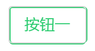
<button class="btn btn-green btn-border-o">按钮一</button>
<button class="btn btn-blue btn-border">按钮二</button>
<button class="btn btn-purple btn-border-rev-o">按钮三</button>
<button class="btn btn-navy btn-border-rev">按钮四</button>
</section>
<section>
<button class="btn btn-orange btn-fill-vert-o">按钮五</button>
<button class="btn btn-red btn-fill-vert">按钮六</button>
<button class="btn btn-green btn-fill-horz-o">按钮七</button>
<button class="btn btn-blue btn-fill-horz">按钮八</button>
</section>
</div>
*, *:before, *:after {
transition: all 0.3s;
}
section {
position: relative;
padding: 5px 0 5px;
text-align: center;
}
.btn {
position: relative;
display: inline-block;
line-height: 35px;
margin: 8px;
padding: 0 15px;
font-size: 15px;
border-radius: 3px;
opacity: .999;
cursor: pointer;
}
.btn-border-o {
background-color: transparent;
border: 1px solid #d0d0d0;
color: #B8B8B8;
}
.btn-border-o:before, .btn-border-o:after {
content: '';
position: absolute;
border-style: solid;
border-radius: 3px;
box-sizing: content-box;
}
.btn-border-o:before {
left: 0;
top: -1px;
width: 0;
height: 100%;
border-width: 1px 0 1px 0;
transition-delay: 0.05s;
}
.btn-border-o:after {
top: 0;
left: -1px;
width: 100%;
height: 0;
border-width: 0 1px 0 1px;
}
.btn-border-o:hover:before {
width: 100%;
}
.btn-border-o:hover:after {
height: 100%;
}
.btn-border-o.btn-green:before, .btn-border-o.btn-green:after {
border-color: #2ecc71;
}
.btn-border-o.btn-green:hover {
color: #2ecc71;
}
.btn-border {
background-color: #e5e5e5;
border: 1px solid #e5e5e5;
color: #a6a6a6;
}
.btn-border:before, .btn-border:after {
position: absolute;
content: '';
border-style: solid;
border-radius: 3px;
box-sizing: content-box;
}
.btn-border:before {
top: -1px;
left: 0;
width: 0;
height: 100%;
border-width: 1px 0 1px 0;
transition-delay: 0.05s;
}
.btn-border:after {
top: 0;
left: -1px;
width: 100%;
height: 0;
border-width: 0 1px 0 1px;
}
.btn-border:hover {
background-color: transparent;
}
.btn-border:hover:before {
width: 100%;
}
.btn-border:hover:after {
height: 100%;
}
.btn-border.btn-blue:before, .btn-border.btn-blue:after {
border-color: #3498db;
}
.btn-border.btn-blue:hover {
color: #3498db;
}
.btn-border-rev-o {
background-color: transparent;
border: 1px solid #d0d0d0;
color: #B8B8B8;
}
.btn-border-rev-o:before, .btn-border-rev-o:after {
content: '';
position: absolute;
border-style: solid;
border-radius: 3px;
box-sizing: content-box;
}
.btn-border-rev-o:before {
top: -1px;
right: 0;
width: 0;
height: 100%;
border-width: 1px 0 1px 0;
transition-delay: 0.05s;
}
.btn-border-rev-o:after {
left: -1px;
bottom: 0;
width: 100%;
height: 0;
border-width: 0 1px 0 1px;
}
.btn-border-rev-o:hover:before {
width: 100%;
}
.btn-border-rev-o:hover:after {
height: 100%;
}
.btn-border-rev-o.btn-purple:before, .btn-border-rev-o.btn-purple:after {
border-color: #9b59b6;
}
.btn-border-rev-o.btn-purple:hover {
color: #9b59b6;
}
.btn-border-rev {
background-color: #e5e5e5;
border: 1px solid #e5e5e5;
color: #a6a6a6;
}
.btn-border-rev:before, .btn-border-rev:after {
content: '';
position: absolute;
border-style: solid;
border-radius: 3px;
box-sizing: content-box;
}
.btn-border-rev:before {
top: -1px;
right: 0;
width: 0;
height: 100%;
border-width: 1px 0 1px 0;
}
.btn-border-rev:after {
bottom: 0;
left: -1px;
width: 100%;
height: 0;
border-width: 0 1px 0 1px;
transition-delay: 0.05s;
}
.btn-border-rev:hover {
background-color: transparent;
}
.btn-border-rev:hover:before {
width: 100%;
}
.btn-border-rev:hover:after {
height: 100%;
}
.btn-border-rev.btn-navy:before, .btn-border-rev.btn-navy:after {
border-color: #34495e;
}
.btn-border-rev.btn-navy:hover {
color: #34495e;
}
.btn-fill-vert-o {
background-color: transparent;
border: 1px solid #d0d0d0;
color: #B8B8B8;
overflow: hidden;
}
.btn-fill-vert-o:before, .btn-fill-vert-o:after {
content: '';
position: absolute;
left: 0;
width: 100%;
height: 0;
opacity: 0;
z-index: -1;
}
.btn-fill-vert-o:before {
top: 50%;
}
.btn-fill-vert-o:after {
bottom: 50%;
}
.btn-fill-vert-o:hover {
color: #fff;
}
.btn-fill-vert-o:hover:before, .btn-fill-vert-o:hover:after {
height: 50%;
opacity: 1;
}
.btn-fill-vert-o.btn-orange:before, .btn-fill-vert-o.btn-orange:after {
background-color: #e67e22;
}
.btn-fill-vert-o.btn-orange:hover {
border-color: #e67e22;
}
.btn-fill-vert {
background-color: #e5e5e5;
border: 1px solid #e5e5e5;
color: #a6a6a6;
overflow: hidden;
}
.btn-fill-vert:before, .btn-fill-vert:after {
content: '';
position: absolute;
width: 100%;
height: 0;
opacity: 0;
left: 0;
z-index: -1;
}
.btn-fill-vert:before {
top: 50%;
}
.btn-fill-vert:after {
bottom: 50%;
}
.btn-fill-vert:hover {
color: #fff;
}
.btn-fill-vert:hover:before, .btn-fill-vert:hover:after {
height: 50%;
opacity: 1;
}
.btn-fill-vert.btn-red:before, .btn-fill-vert.btn-red:after {
background-color: #e74c3c;
}
.btn-fill-vert.btn-red:hover {
border-color: #e74c3c;
}
.btn-fill-horz-o {
background-color: transparent;
border: 1px solid #d0d0d0;
color: #B8B8B8;
overflow: hidden;
}
.btn-fill-horz-o:before, .btn-fill-horz-o:after {
content: '';
position: absolute;
top: 0;
width: 0;
height: 100%;
opacity: 0;
z-index: -1;
}
.btn-fill-horz-o:before {
left: 50%;
}
.btn-fill-horz-o:after {
right: 50%;
}
.btn-fill-horz-o:hover {
color: #fff;
}
.btn-fill-horz-o:hover:before, .btn-fill-horz-o:hover:after {
width: 50%;
opacity: 1;
}
.btn-fill-horz-o.btn-green:before, .btn-fill-horz-o.btn-green:after {
background-color: #2ecc71;
}
.btn-fill-horz-o.btn-green:hover {
border-color: #2ecc71;
}
.btn-fill-horz {
background-color: #e5e5e5;
border: 1px solid #e5e5e5;
color: #a6a6a6;
overflow: hidden;
}
.btn-fill-horz:before, .btn-fill-horz:after {
content: '';
position: absolute;
top: 0;
width: 0;
height: 100%;
opacity: 0;
z-index: -1;
}
.btn-fill-horz:before {
left: 50%;
}
.btn-fill-horz:after {
right: 50%;
}
.btn-fill-horz:hover {
color: #fff;
}
.btn-fill-horz:hover:before, .btn-fill-horz:hover:after {
width: 50%;
opacity: 1;
}
.btn-fill-horz.btn-blue:before, .btn-fill-horz.btn-blue:after {
background-color: #3498db;
}
.btn-fill-horz.btn-blue:hover {
border-color: #3498db;
}
总结
以上所述是小编给大家介绍的基于CSS 属性实现按钮悬停边框和背景动画集合 ,希望对大家有所帮助,如果大家有任何疑问请给我留言,小编会及时回复大家的。在此也非常感谢大家对程序员之家网站的支持!
如果你觉得本文对你有帮助,欢迎转载,烦请注明出处,谢谢!
相关文章
 这篇文章主要介绍了CSS+JS实现水滴涟漪动画按钮,本文通过实例代码给大家介绍的非常详细,对大家的学习或工作具有一定的参考借鉴价值,需要的朋友参考下吧2020-08-26
 这篇文章主要介绍了css实现抖音订阅按钮动画效果,本文通过实例代码给大家介绍的非常详细,对大家的学习或工作具有一定的参考借鉴价值,需要的朋友可以参考下2020-03-12
 这篇文章主要介绍了CSS实现菜单按钮动画,本文通过实例代码给大家介绍的非常详细,需要的朋友可以参考下2019-04-12
 这篇文章主要介绍了纯css实现Material Design中的水滴动画按钮的相关资料,小编觉得挺不错的,现在分享给大家,也给大家做个参考。一起跟随小编过来看看吧2018-10-26
- 本文通过实例代码给大家介绍了基于 CSS 动画的 SVG 按钮的实现方法,非常不错,具有一定的参考借鉴价值,需要的朋友参考下吧2018-10-12
 按钮在开发中使用的频率非常的高,ui 框架中的按钮组件也都是层出不穷,今天教大家仅用 css 实现一些非常炫酷的按钮效果,感兴趣的朋友跟随小编一起学习吧2023-02-28


最新评论