


使用纯 CSS 创作一个渐变色动画边框
发布时间:2018-11-20 14:19:18 作者:佚名  我要评论
我要评论
我要评论这篇文章主要介绍了使用纯 CSS 创作一个渐变色动画边框,需要的朋友可以参考下
(福利推荐:你还在原价购买阿里云服务器?现在阿里云0.8折限时抢购活动来啦!4核8G企业云服务器仅2998元/3年,立即抢购>>>:9i0i.cn/aliyun)

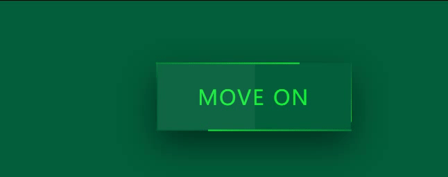
效果预览
按下右侧的“点击预览”按钮可以在当前页面预览,点击链接可以全屏预览。
https://codepen.io/comehope/pen/odpRKX
可交互视频教程
此视频是可以交互的,你可以随时暂停视频,编辑视频中的代码。
请用 chrome, safari, edge 打开观看。
源代码下载
请从 github 下载。
代码解读
定义 dom,一个容器中包含一些文字:
<div class="box">
    you are my<br>
    FAVORITE
</div>
居中显示:
html,
body,
.box {
    height: 100%;
    display: flex;
    align-items: center;
    justify-content: center;
}
设置页面背景色:
body {
    background: #222;
}
设置容器和文字样式:
.box {
    color: white;
    font-size: 2.5em;
    width: 10em;
    height: 5em;
    background: #111;
    font-family: sans-serif;
    line-height: 1.5em;
    text-align: center;
    border-radius: 0.2em;
}
用伪元素增加一个背板:
.box {
    position: relative;
}

.box::after {
    content: '';
    position: absolute;
    width: 102%;
    height: 104%;
    background-color: orange;
    z-index: -1;
    border-radius: 0.2em;
}
把背板设置为渐变色的:
.box::after {
    /*background-color: orange;*/
    background-image: linear-gradient(60deg, aquamarine, cornflowerblue, goldenrod, hotpink, salmon, lightgreen, sandybrown, violet);
}
为背板设置动画效果:
.box::after {
    background-size: 300%, 300%;
    animation: animate_bg 5s ease infinite alternate;
}

@keyframes animate_bg {
    0% {
        background-position: 0%, 50%;
    }

    50% {
        background-position: 100%, 50%;
    }

    100% {
        background-position: 0%, 50%;
    }
}
最后,再为文字增加变色效果:
.box {
    animation: animate_text 2s linear infinite alternate;
}

@keyframes animate_text {
    from {
        color: lime;
    }

    to {
        color: yellow;
    }
}
大功告成!
知识点
•z-index https://developer.mozilla.org/en-US/docs/Web/CSS/z-index
•background-image https://developer.mozilla.org/en-US/docs/Web/CSS/background-image
•background-size https://developer.mozilla.org/en-US/docs/Web/CSS/background-size
•background-position https://developer.mozilla.org/en-US/docs/Web/CSS/background-position
总结
以上所述是小编给大家介绍的使用纯 CSS 创作一个渐变色动画边框,希望对大家有所帮助,如果大家有任何疑问请给我留言,小编会及时回复大家的。在此也非常感谢大家对程序员之家网站的支持!
相关文章
 这篇文章主要介绍了CSS3 按钮边框动画的实现,帮助大家更好的理解和使用CSS3,美化自身网页,感兴趣的朋友可以了解下2020-11-12
 这篇文章主要介绍了CSS 奇思妙想边框动画效果的实现,本文给大家介绍的非常详细,对大家的学习或工作具有一定的参考借鉴价值,需要的朋友可以参考下2021-01-18


最新评论