


纯CSS绘制三角形箭头效果
发布时间:2014-05-07 13:23:23 作者:佚名  我要评论
我要评论
我要评论最近我想修改一下这个网站,我想在上面放置一个提示框。这是很容易,但我想让提示框上有一个三角形的箭头。可是,一想到这需要使用图片,并且各种颜色,各种方向的箭头要准备无数种,这几乎是一种灾难。幸运的是,MooTools的核心开发着Darren Waddell告诉了我一个非常棒
(福利推荐:你还在原价购买阿里云服务器?现在阿里云0.8折限时抢购活动来啦!4核8G企业云服务器仅2998元/3年,立即抢购>>>:9i0i.cn/aliyun)
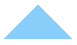
使用纯CSS,你只需要很少的代码就可以创作出各种浏览器都兼容的三角形箭头!

CSS代码
复制代码
代码如下:/* create an arrow that points up */
div.arrow-up {
width: 0;
height: 0;
border-left: 5px solid transparent; /* left arrow slant */
border-right: 5px solid transparent; /* right arrow slant */
border-bottom: 5px solid #2f2f2f; /* bottom, add background color here */
font-size: 0;
line-height: 0;
}
/* create an arrow that points down */
div.arrow-down {
width: 0;
height: 0;
border-left: 5px solid transparent;
border-right: 5px solid transparent;
border-top: 5px solid #2f2f2f;
font-size: 0;
line-height: 0;
}
/* create an arrow that points left */
div.arrow-left {
width: 0;
height: 0;
border-bottom: 5px solid transparent; /* left arrow slant */
border-top: 5px solid transparent; /* right arrow slant */
border-right: 5px solid #2f2f2f; /* bottom, add background color here */
font-size: 0;
line-height: 0;
}
/* create an arrow that points right */
div.arrow-right {
width: 0;
height: 0;
border-bottom: 5px solid transparent; /* left arrow slant */
border-top: 5px solid transparent; /* right arrow slant */
border-left: 5px solid #2f2f2f; /* bottom, add background color here */
font-size: 0;
line-height: 0;
}
绘制这些三角形的关键在于,你要让箭头所指方向的两个侧边有很粗的边框。而背向箭头方向的一边也是同样粗的边框,而这条边的颜色就是你的三角形的颜色。边框越粗,三角形越大。用这种方法你可以绘制出各种颜色、各种大小、各种朝向的箭头。最妙的是,你只需要几行CSS代码就能实现这种效果。
使用:before和:after绘制CSS三角形
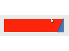
上面的CSS例子使用的是真正的页面元素进行绘制,但有时候这个真正的元素还有它用,你不能走上面直接进行操作,这是怎么办?纯CSS的三角形其实还可以使用伪元素(pseudo-element)进行绘制。下面就是绘制方法:
复制代码
代码如下:div.tooltip {
/* tooltip content styling in here; nothing to do with arrows */
}
/* shared with before and after */
div.tooltip:before, div.tooltip:after {
content: ' ';
height: 0;
position: absolute;
width: 0;
border: 10px solid transparent; /* arrow size */
}
/* these arrows will point up */
/* top-stacked, smaller arrow */
div.tooltip:before {
border-bottom-color: #fff; /* arrow color */</p> <p> /* positioning */
position: absolute;
top: -19px;
left: 255px;
z-index: 2;
}
/* arrow which acts as a background shadow */
div.tooltip:after {
border-bottom-color: #333; /* arrow color */</p> <p> /* positioning */
position: absolute;
top: -24px;
left: 255px;
z-index: 1;
}
背向箭头的那一侧的边框的颜色就是三角形箭头的颜色。画这个箭头并不需要同时使用:before和:after两个伪元素——一个就够了。而另外一个,你可以把它用作前一个的背景阴影或背景边。
真应该早点知道这种技术!我相信在将来做界面改进时这种简洁省事的技术将派上大用途。
相关文章
 这篇文章主要介绍了CSS绘制三角形的实现代码(border法)的相关资料,小编觉得挺不错的,现在分享给大家,也给大家做个参考。一起跟随小编过来看看吧2018-09-11
- 相信大家在日常网站布局中,经常遇到一些三角形形状的按钮,有的人可能会想到用图片代替,其实我们利用css就可以实现,本文给大家介绍了利用css绘制三角形的方法,以及一些2016-10-17
- 这篇文章主要为大家详细介绍了纯CSS绘制三角形箭头图案技术,如何使用:before和:after绘制CSS三角形,感兴趣的小伙伴们可以参考一下2016-06-28
- 这篇文章主要为大家详细介绍了Html+CSS绘制三角形图标的相关代码,很多网页都有三角形的图标,通常是切的图片,这里可以用css3+html写出三角形,感兴趣的小伙伴们可以参考2016-06-17
- 这篇文章主要教大家使用css绘制透明三角形,css绘制三角形很简单,如何绘制透明的三角形,本文为大家解决这个问题,感兴趣的小伙伴们可以参考一下2016-03-10
- 这篇文章主要介绍了用CSS3绘制三角形的简单方法,是CSS前端绘图的基础,需要的朋友可以参考下2015-07-17
- 用CSS也可以画画了.不错哦.下面我们来画一个三角形看看2012-06-04
 这篇文章主要介绍了CSS中三角形的绘制与巧妙应用,本文通过实例代码给大家介绍的非常详细,对大家的学习或工作具有一定的参考借鉴价值,需要的朋友可以参考下2020-09-11


最新评论