


纯css实现一款仿ios7的switches开关按钮
发布时间:2014-10-22 15:32:13 作者:佚名  我要评论
我要评论
我要评论这篇文章主要为大家介绍了纯css实现的一款仿ios7的switches开关按钮,无需引js代码。在实现中给出了两种颜色,三种不同大小的demo,需要的朋友可以参考下
(福利推荐:你还在原价购买阿里云服务器?现在阿里云0.8折限时抢购活动来啦!4核8G企业云服务器仅2998元/3年,立即抢购>>>:9i0i.cn/aliyun)
今天给大家介绍一款仿ios7的switches开关按钮。这款按钮也是纯css实现的。无需引js代码。在实现中给出了两种颜色,三种不同大小的demo。一起看下效果图:

实现的代码。
html代码:
复制代码
代码如下:<div class="wrap" style="width: 600px; margin: auto;">
<h1>
iOS 7 style switches with CSS</h1>
<h2>
By Bandar Raffah</h2>
<label>
Big<input type="checkbox" class="ios-switch green bigswitch" checked /><div>
<div>
</div>
</div>
</label>
<label>
<input type="checkbox" class="ios-switch bigswitch" checked /><div>
<div>
</div>
</div>
</label>
<label>
Normal<input type="checkbox" class="ios-switch green" /><div>
<div>
</div>
</div>
</label>
<label>
<input type="checkbox" class="ios-switch" /><div>
<div>
</div>
</div>
</label>
<label>
Tiny<input type="checkbox" class="ios-switch green tinyswitch" checked /><div>
<div>
</div>
</div>
</label>
<label>
<input type="checkbox" class="ios-switch tinyswitch" checked /><div>
<div>
</div>
</div>
</label>
</div>
css代码:
复制代码
代码如下:input[type="checkbox"]
{
position: absolute;
opacity: 0;
}
/* Normal Track */
input[type="checkbox"].ios-switch + div
{
vertical-align: middle;
width: 40px;
height: 20px;
border: 1px solid rgba(0,0,0,.4);
border-radius: 999px;
background-color: rgba(0, 0, 0, 0.1);
-webkit-transition-duration: .4s;
-webkit-transition-property: background-color, box-shadow;
box-shadow: inset 0 0 0 0px rgba(0,0,0,0.4);
margin: 15px 1.2em 15px 2.5em;
}
/* Checked Track (Blue) */
input[type="checkbox"].ios-switch:checked + div
{
width: 40px;
background-position: 0 0;
background-color: #3b89ec;
border: 1px solid #0e62cd;
box-shadow: inset 0 0 0 10px rgba(59,137,259,1);
}
/* Tiny Track */
input[type="checkbox"].tinyswitch.ios-switch + div
{
width: 34px;
height: 18px;
}
/* Big Track */
input[type="checkbox"].bigswitch.ios-switch + div
{
width: 50px;
height: 25px;
}
/* Green Track */
input[type="checkbox"].green.ios-switch:checked + div
{
background-color: #00e359;
border: 1px solid rgba(0, 162, 63,1);
box-shadow: inset 0 0 0 10px rgba(0,227,89,1);
}
/* Normal Knob */
input[type="checkbox"].ios-switch + div > div
{
float: left;
width: 18px;
height: 18px;
border-radius: inherit;
background: #ffffff;
-webkit-transition-timing-function: cubic-bezier(.54,1.85,.5,1);
-webkit-transition-duration: 0.4s;
-webkit-transition-property: transform, background-color, box-shadow;
-moz-transition-timing-function: cubic-bezier(.54,1.85,.5,1);
-moz-transition-duration: 0.4s;
-moz-transition-property: transform, background-color;
box-shadow: 0px 2px 5px rgba(0, 0, 0, 0.3), 0px 0px 0 1px rgba(0, 0, 0, 0.4);
pointer-events: none;
margin-top: 1px;
margin-left: 1px;
}
/* Checked Knob (Blue Style) */
input[type="checkbox"].ios-switch:checked + div > div
{
-webkit-transform: translate3d(20px, 0, 0);
-moz-transform: translate3d(20px, 0, 0);
background-color: #ffffff;
box-shadow: 0px 2px 5px rgba(0, 0, 0, 0.3), 0px 0px 0 1px rgba(8, 80, 172,1);
}
/* Tiny Knob */
input[type="checkbox"].tinyswitch.ios-switch + div > div
{
width: 16px;
height: 16px;
margin-top: 1px;
}
/* Checked Tiny Knob (Blue Style) */
input[type="checkbox"].tinyswitch.ios-switch:checked + div > div
{
-webkit-transform: translate3d(16px, 0, 0);
-moz-transform: translate3d(16px, 0, 0);
box-shadow: 0px 2px 5px rgba(0, 0, 0, 0.3), 0px 0px 0 1px rgba(8, 80, 172,1);
}
/* Big Knob */
input[type="checkbox"].bigswitch.ios-switch + div > div
{
width: 23px;
height: 23px;
margin-top: 1px;
}
/* Checked Big Knob (Blue Style) */
input[type="checkbox"].bigswitch.ios-switch:checked + div > div
{
-webkit-transform: translate3d(25px, 0, 0);
-moz-transform: translate3d(16px, 0, 0);
box-shadow: 0px 4px 8px rgba(0, 0, 0, 0.3), 0px 0px 0 1px rgba(8, 80, 172,1);
}
/* Green Knob */
input[type="checkbox"].green.ios-switch:checked + div > div
{
box-shadow: 0px 2px 5px rgba(0, 0, 0, 0.3), 0 0 0 1px rgba(0, 162, 63,1);
}
/* Needless Page Decoration */
body
{
-webkit-user-select: none;
cursor: default;
font: 18px "Helvetica Neue";
color: rgba(0, 0, 0, 0.77);
font-weight: 200;
padding-left: 30px;
padding-top: 0px;
background: -webkit-linear-gradient(top, #f2fbff 0%, #ffffff 64%) no-repeat;
background: -moz-linear-gradient(top, #f2fbff 0%, #ffffff 64%) no-repeat;
background: -ms-linear-gradient(top, #f2fbff 0%, #ffffff 64%) no-repeat;
background: linear-gradient(to bottom, #f2fbff 0%, #ffffff 64%) no-repeat;
}
h1
{
font-weight: 100;
font-size: 40px;
color: #135ae4;
}
h2
{
font-weight: 200;
font-size: 22px;
color: #03b000;
}
h3
{
font-weight: 200;
font-size: 18px;
color: rgba(0, 0, 0, 0.77);
margin-top: 50px;
}
a:link
{
text-decoration: none;
color: #f06;
}
a:visited
{
text-decoration: none;
color: #f06;
}
a:hover
{
text-decoration: underline;
}
a:active
{
text-decoration: underline;
}
{
position: absolute;
opacity: 0;
}
/* Normal Track */
input[type="checkbox"].ios-switch + div
{
vertical-align: middle;
width: 40px;
height: 20px;
border: 1px solid rgba(0,0,0,.4);
border-radius: 999px;
background-color: rgba(0, 0, 0, 0.1);
-webkit-transition-duration: .4s;
-webkit-transition-property: background-color, box-shadow;
box-shadow: inset 0 0 0 0px rgba(0,0,0,0.4);
margin: 15px 1.2em 15px 2.5em;
}
/* Checked Track (Blue) */
input[type="checkbox"].ios-switch:checked + div
{
width: 40px;
background-position: 0 0;
background-color: #3b89ec;
border: 1px solid #0e62cd;
box-shadow: inset 0 0 0 10px rgba(59,137,259,1);
}
/* Tiny Track */
input[type="checkbox"].tinyswitch.ios-switch + div
{
width: 34px;
height: 18px;
}
/* Big Track */
input[type="checkbox"].bigswitch.ios-switch + div
{
width: 50px;
height: 25px;
}
/* Green Track */
input[type="checkbox"].green.ios-switch:checked + div
{
background-color: #00e359;
border: 1px solid rgba(0, 162, 63,1);
box-shadow: inset 0 0 0 10px rgba(0,227,89,1);
}
/* Normal Knob */
input[type="checkbox"].ios-switch + div > div
{
float: left;
width: 18px;
height: 18px;
border-radius: inherit;
background: #ffffff;
-webkit-transition-timing-function: cubic-bezier(.54,1.85,.5,1);
-webkit-transition-duration: 0.4s;
-webkit-transition-property: transform, background-color, box-shadow;
-moz-transition-timing-function: cubic-bezier(.54,1.85,.5,1);
-moz-transition-duration: 0.4s;
-moz-transition-property: transform, background-color;
box-shadow: 0px 2px 5px rgba(0, 0, 0, 0.3), 0px 0px 0 1px rgba(0, 0, 0, 0.4);
pointer-events: none;
margin-top: 1px;
margin-left: 1px;
}
/* Checked Knob (Blue Style) */
input[type="checkbox"].ios-switch:checked + div > div
{
-webkit-transform: translate3d(20px, 0, 0);
-moz-transform: translate3d(20px, 0, 0);
background-color: #ffffff;
box-shadow: 0px 2px 5px rgba(0, 0, 0, 0.3), 0px 0px 0 1px rgba(8, 80, 172,1);
}
/* Tiny Knob */
input[type="checkbox"].tinyswitch.ios-switch + div > div
{
width: 16px;
height: 16px;
margin-top: 1px;
}
/* Checked Tiny Knob (Blue Style) */
input[type="checkbox"].tinyswitch.ios-switch:checked + div > div
{
-webkit-transform: translate3d(16px, 0, 0);
-moz-transform: translate3d(16px, 0, 0);
box-shadow: 0px 2px 5px rgba(0, 0, 0, 0.3), 0px 0px 0 1px rgba(8, 80, 172,1);
}
/* Big Knob */
input[type="checkbox"].bigswitch.ios-switch + div > div
{
width: 23px;
height: 23px;
margin-top: 1px;
}
/* Checked Big Knob (Blue Style) */
input[type="checkbox"].bigswitch.ios-switch:checked + div > div
{
-webkit-transform: translate3d(25px, 0, 0);
-moz-transform: translate3d(16px, 0, 0);
box-shadow: 0px 4px 8px rgba(0, 0, 0, 0.3), 0px 0px 0 1px rgba(8, 80, 172,1);
}
/* Green Knob */
input[type="checkbox"].green.ios-switch:checked + div > div
{
box-shadow: 0px 2px 5px rgba(0, 0, 0, 0.3), 0 0 0 1px rgba(0, 162, 63,1);
}
/* Needless Page Decoration */
body
{
-webkit-user-select: none;
cursor: default;
font: 18px "Helvetica Neue";
color: rgba(0, 0, 0, 0.77);
font-weight: 200;
padding-left: 30px;
padding-top: 0px;
background: -webkit-linear-gradient(top, #f2fbff 0%, #ffffff 64%) no-repeat;
background: -moz-linear-gradient(top, #f2fbff 0%, #ffffff 64%) no-repeat;
background: -ms-linear-gradient(top, #f2fbff 0%, #ffffff 64%) no-repeat;
background: linear-gradient(to bottom, #f2fbff 0%, #ffffff 64%) no-repeat;
}
h1
{
font-weight: 100;
font-size: 40px;
color: #135ae4;
}
h2
{
font-weight: 200;
font-size: 22px;
color: #03b000;
}
h3
{
font-weight: 200;
font-size: 18px;
color: rgba(0, 0, 0, 0.77);
margin-top: 50px;
}
a:link
{
text-decoration: none;
color: #f06;
}
a:visited
{
text-decoration: none;
color: #f06;
}
a:hover
{
text-decoration: underline;
}
a:active
{
text-decoration: underline;
}
相关文章
 这篇文章主要介绍了如何用css3实现switch组件的方法的相关资料,小编觉得挺不错的,现在分享给大家,也给大家做个参考。一起跟随小编过来看看吧2018-02-09
 CSS3实现的创意互动式开关切换按钮特效源码是一段实现了多组创意的CSS3动画按钮特效,如:白天黑夜、难过开心、高亮等等,非常实用,欢迎有需要的朋友前来下载使用2018-01-26
 CSS3美化单选/复选/开关按钮样式特效源码是一款纯CSS3的单选框,复选框,开关按钮UI库,实现了按钮可选和按钮不可选的效果,非常不错,欢迎有需要的朋友前来下载使用2017-12-21
 这是一款基于纯CSS3实现漂亮的点击开关切换动画效果源码。界面上的开关按钮点击时可呈现出带有弹性翻牌动作的动画视觉效果2017-11-02
纯CSS3实现的炫酷checkbox复选框美化库checkboxes.css(含开关按钮美化
checkboxes.css是一款纯CSS3炫酷checkbox复选框美化库。checkboxes.css可以通过在HTML代码中简单的class配置,生成多种不同效果的checkbox美化样式,其中包括复选框按钮美2017-09-05 这是一款基于纯css3实现的仿窗帘拉开关闭百叶窗动画特效源码。右侧有两个下拉杆,可点击控制百叶窗的打开与折叠收起等动画效果。2017-06-22
- 这篇文章主要为大家详细介绍了CSS3模拟IOS滑动开关效果,具有一定的参考价值,感兴趣的小伙伴们可以参考一下2016-09-28
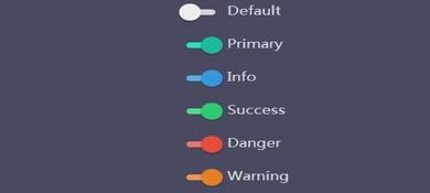 本特效是一组使用CSS3制作的精美滑动开关按钮效果的代码,这组滑动按钮按Bootstrap的情景类来设计,可以适应5种不同的场景2016-09-23
 本源码是一个使用纯CSS3制作的滑动开关按钮特效的代码。使用伪元素来制作外观,制作出4种安卓样式特效2016-04-07
 是一款可以使用鼠标来控制开关滑动,按钮开关滑动时带有很炫的动画和渐变效果的代码,本段代码适应于所有网页使用,有兴趣的朋友们可以前来下载使用2015-10-15


最新评论