


基于CSS实现网页悬浮菜单效果
发布时间:2023-02-13 11:47:37 作者:水星记_  我要评论
我要评论
我要评论平时我们在浏览网页时,如下图的导航栏已经屡见不鲜了,当鼠标放上去时,右侧隐藏的内容就会慢慢平滑展开,非常美观且实用,今天小编通过本文给大家分享基于CSS实现网页悬浮菜单效果,感兴趣的朋友一起看看吧
(福利推荐:你还在原价购买阿里云服务器?现在阿里云0.8折限时抢购活动来啦!4核8G企业云服务器仅2998元/3年,立即抢购>>>:9i0i.cn/aliyun)
前言
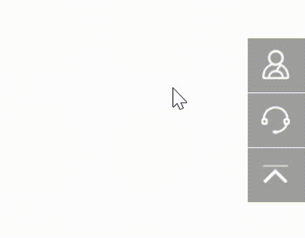
平时我们在浏览网页时,如下图的导航栏已经屡见不鲜了,当鼠标放上去时,右侧隐藏的内容就会慢慢平滑展开,非常美观且实用,那你知道这种效果是怎么实现的吗?下面我们就一起实践一下。
如图所示:
实现思路
- 首先我们需要把所有的导航栏通过
fixed属性定位到网页的右下角; - 设置
transition属性将所有导航栏添加平滑的过渡效果; - 利用
right属性将所有导航栏向右偏移; - 当鼠标触摸某一个导航栏时,运用
hover属性,将right的值设置为0px,配合之前说到的transition属性让其右侧内容平滑的展示出来即可。
话不多说,下面直接看源码
完整源码
<template>
  <div class="parentBox">
    <div class="contantsBox">
      <div>
        <span><img src="../assets/yuyue.png" /></span>
        <span>预约体验</span>
      </div>
      <div>
        <span><img src="../assets/kefu.png" /></span>
        <span>联系客服</span>
      </div>
      <div>
        <span><img src="../assets/fhdb.png" /></span>
        <span>回到顶部</span>
      </div>
    </div>
  </div>
</template>
<style lang="scss" scoped>
.parentBox {
  height: 100%;
  background: gainsboro;
  overflow: hidden;
  overflow-y: auto;
  .contantsBox {
    div {
      transition: all 0.7s;
      position: fixed;
      right: -127px;
      width: 180px;
      background: rgba(96, 96, 96, 0.6);
      color: #fff;
      padding: 8px 10px;
      cursor: pointer;
      display: flex;
      align-items: center;
      span:last-child {
        margin-left: 16px;
      }
      img {
        width: 32px;
        height: 32px;
        vertical-align: middle;
      }
    }
    div:nth-child(1) {
      bottom: 197px;
    }
    div:nth-child(2) {
      bottom: 148px;
    }
    div:nth-child(3) {
      bottom: 100px;
    }
    div:hover {
      right: 0px;
      cursor: auto;
      span {
        cursor: pointer;
      }
    }
    div:not(:last-child) {
      border-bottom: 1px solid #fff;
    }
  }
}
// 隐藏浏览器滚动条
::-webkit-scrollbar {
  display: none;
}
</style>
拓展延伸
当然,上面实现的操作只是一种展现形式,类似的功能在效果上可能大相径庭,接下来带大家一起看看下面这几个案例实现的效果。
案例1
完整源码
<template>
  <div class="parentBox">
    <div class="menusBox">
      <p><span data-text='快速上手'>快速上手</span></p>
      <p><span data-text="进阶用法">进阶用法</span></p>
      <p><span data-text="开发指南">开发指南</span></p>
    </div>
  </div>
</template>
<style lang="less" scoped>
.parentBox {
  padding: 50px;
  height: 100%;
  background: rgb(37, 34, 51);
  .menusBox {
    background: rgba(0, 0, 0, 0.4);
    border-bottom: 1px solid rgba(241, 241, 241, 0.25);
    box-shadow: 0 0 8px rgba(0, 0, 0, 0.4) inset;
    border-radius: 16px;
    width: 30%;
    display: flex;
    justify-content: space-around;
    height: 50px;
    margin: 0 auto;
    overflow: hidden;
    p {
      cursor: pointer;
      span {
        text-transform: uppercase;
        color: #fff;
        margin-top: -50px;
        transition: 0.3s cubic-bezier(0.1, 0.1, 0.5, 1.4);
      }
      span:before {
        content: attr(data-text);
        /*直接使用data-text属性的值*/
        display: block;
        color: rgb(173, 255, 43);
      }
      span:hover {
        margin-top: 0;
      }
    }
    p * {
      display: inline-block;
      font-size: 18px;
      line-height: 50px;
    }
  }
}
</style>
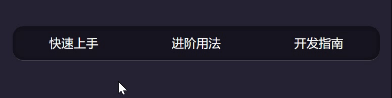
效果图
案例2
完整源码
<template>
  <div class="parentBox">
    <div class="navBox">
      <p>导航菜单</p>
      <ul class="menuBox">
        <li><span class="contnatBox">A</span></li>
        <li><span class="contnatBox">B</span></li>
        <li><span class="contnatBox">C</span></li>
        <li><span class="contnatBox">D</span></li>
        <li><span class="contnatBox">E</span></li>
        <li><span class="contnatBox">F</span></li>
        <li><span class="contnatBox">G</span></li>
        <li><span class="contnatBox">H</span></li>
        <li><span class="contnatBox">I</span></li>
      </ul>
    </div>
  </div>
</template>
<style lang="less" scoped>
.parentBox {
  height: 100%;
  background: #74777b;
  padding: 100px 0;
  transform: translate3d(0, 0, 0);
  *:after,
  *:before {
    -webkit-box-sizing: border-box;
    -moz-box-sizing: border-box;
    box-sizing: border-box;
  }
  span {
    color: rgba(255, 255, 255, 0.6);
    outline: none;
    text-decoration: none;
    -webkit-transition: 0.2s;
    transition: 0.2s;
  }
  span:hover,
  span:focus {
    cursor: pointer;
    color: #74777b;
    text-decoration: none;
  }
  .navBox {
    width: 150px;
    height: 150px;
    line-height: 150px;
    border-radius: 50%;
    background: #fff;
    margin: 70px auto;
    position: relative;
    cursor: pointer;
    text-align: center;
    font-size: 1.75em;
    font-weight: bold;
    color: cornflowerblue;
    transition: 0.24s 0.2s;
    .menuBox {
      list-style: none;
      padding: 0;
      margin: 0;
      position: absolute;
      top: -75px;
      left: -75px;
      border: 150px solid transparent;
      cursor: default;
      border-radius: 50%;
      transform: scale(0);
      transition: transform 1.4s 0.07s;
      z-index: -1;
    }
    .menuBox li {
      position: absolute;
      top: -100px;
      left: -100px;
      transform-origin: 100px 100px;
      transition: all 0.5s 0.1s;
    }
    .menuBox li span {
      width: 45px;
      height: 45px;
      line-height: 45px;
      border-radius: 50%;
      background: #fff;
      position: absolute;
      font-size: 60%;
      color: cornflowerblue;
      transition: 0.6s;
    }
    .menuBox li span:hover {
      background: rgba(255, 255, 255, 0.7);
    }
  }

  .navBox:hover {
    background: rgba(255, 255, 255, 0.8);
  }

  .navBox:hover .menuBox {
    transition: transform 0.4s 0.08s, z-index 0s 0.5s;
    transform: scale(1);
    z-index: 1;
  }

  .navBox:hover .menuBox li {
    transition: all 0.6s;
  }

  .navBox:hover .menuBox li:nth-child(1) {
    transition-delay: 0.02s;
    transform: rotate(85deg);
  }

  .navBox:hover .menuBox li:nth-child(1) span {
    transition-delay: 0.04s;
    transform: rotate(635deg);
  }

  .navBox:hover .menuBox li:nth-child(2) {
    transition-delay: 0.04s;
    transform: rotate(125deg);
  }

  .navBox:hover .menuBox li:nth-child(2) span {
    transition-delay: 0.08s;
    transform: rotate(595deg);
  }

  .navBox:hover .menuBox li:nth-child(3) {
    transition-delay: 0.06s;
    transform: rotate(165deg);
  }

  .navBox:hover .menuBox li:nth-child(3) span {
    transition-delay: 0.12s;
    transform: rotate(555deg);
  }

  .navBox:hover .menuBox li:nth-child(4) {
    transition-delay: 0.08s;
    transform: rotate(205deg);
  }

  .navBox:hover .menuBox li:nth-child(4) span {
    transition-delay: 0.16s;
    transform: rotate(515deg);
  }

  .navBox:hover .menuBox li:nth-child(5) {
    transition-delay: 0.1s;
    transform: rotate(245deg);
  }

  .navBox:hover .menuBox li:nth-child(5) span {
    transition-delay: 0.2s;
    transform: rotate(475deg);
  }

  .navBox:hover .menuBox li:nth-child(6) {
    transition-delay: 0.12s;
    transform: rotate(285deg);
  }

  .navBox:hover .menuBox li:nth-child(6) span {
    transition-delay: 0.24s;
    transform: rotate(435deg);
  }

  .navBox:hover .menuBox li:nth-child(7) {
    transition-delay: 0.14s;
    transform: rotate(325deg);
  }

  .navBox:hover .menuBox li:nth-child(7) span {
    transition-delay: 0.28s;
    transform: rotate(395deg);
  }

  .navBox:hover .menuBox li:nth-child(8) {
    transition-delay: 0.16s;
    transform: rotate(365deg);
  }

  .navBox:hover .menuBox li:nth-child(8) span {
    transition-delay: 0.32s;
    transform: rotate(355deg);
  }

  .navBox:hover .menuBox li:nth-child(9) {
    transition-delay: 0.18s;
    transform: rotate(405deg);
  }

  .navBox:hover .menuBox li:nth-child(9) span {
    transition-delay: 0.36s;
    transform: rotate(315deg);
  }
}
</style>
效果图

到此这篇关于基于CSS实现网页悬浮菜单效果的文章就介绍到这了,更多相关css网页悬浮菜单内容请搜索程序员之家以前的文章或继续浏览下面的相关文章,希望大家以后多多支持程序员之家!
相关文章
CSS简单实现网页悬浮效果(对联广告)-CSS教程-网页制作-网页教学网
css固定定位,即悬浮效果(例如对联广告),不用js,css中"position:fixed;"即可。 position:fixed; 以视口为包含块,因此在浏览器窗口内固定。 ie 6.0不支持,2008-10-17 这篇文章主要介绍了纯CSS实现DIV悬浮的示例代码(固定位置),文中通过示例代码介绍的非常详细,对大家的学习或者工作具有一定的参考学习价值,需要的朋友们下面随着小编来一2021-01-07
 这篇文章主要介绍了CSS 鼠标悬浮在图片上添加遮罩层效果的实现,本文通过实例代码给大家介绍的非常详细,对大家的学习或工作具有一定的参考借鉴价值,需要的朋友可以参考下2020-12-17
 这篇文章主要介绍了css实现悬浮客服效果,本文通过实例代码给大家介绍的非常详细,具有一定的参考借鉴价值,需要的朋友可以参考下2020-01-13
 这篇文章主要介绍了css做个波浪悬浮球的实现方法的相关资料,小编觉得挺不错的,现在分享给大家,也给大家做个参考。一起跟随小编过来看看吧2019-05-14


最新评论